How To Maximize The Quality Of YouTube Videos (using Resolve)

September 5, 2023

Learn how to set up DaVinci Resolve's color management when delivering to YouTube and modify the default preset for better quality.


Series

Part 1: Delivering to YouTube… and making it look correct!

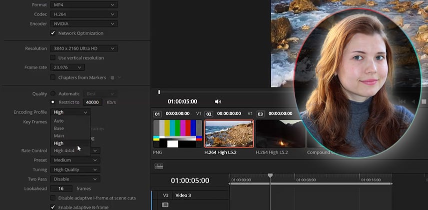
Remove your doubts about delivering to YouTube from DaVinci Resolve. After the correct color space options are addressed in DaVinci Resolve’s color management settings, this Insight focuses on optimizing your image quality for the best results on YouTube using DaVinci Resolve’s Deliver page’s Render Settings.

Note: The first two minutes address exporting from a Windows machine. After that, PC and Mac (or Linux) users will all benefit from the rest of the Insight about optimizing your Deliver page presets.

Mastering DaVinci Resolve’s Deliver Page Presets

Delivering to YouTube from DaVinci Resolve is straightforward, especially if you’re on a Windows machine. The YouTube preset on the Deliver page is set up according to YouTube’s own website specs, so rendering a good-quality file takes just a couple of clicks. On a Mac, things are different – so we’ll cover Apple-specific settings in Part 2 of this short series.

Regarding the color space, YouTube recommends BT.709, also known as Rec.709, which features a D65 white point. Its treatment of the gamma is as a non-linear OETF (scene to video) intended for CRT displays, which is Gamma 2.4. This setting is optimal for users working with a grading monitor.

However, Rec.709 (scene) works equally well for YouTube deliverables. The appropriate BT.709 transfer function metadata is embedded in the rendered file, which is correctly interpreted by YouTube upon upload. In fact, Rec.709 (scene) is recommended by the Davinci Resolve developers specifically for web deliverables by users who are uncertain (or unaware) of color management.

They aim to ensure the average user produces a clean, consistent image when rendering out of Resolve.

After demonstrating how easily timelines can be set up and exported, the remainder of this Insight focuses on optimizing the quality of your rendered video by accessing the custom settings of the YouTube preset and altering them for higher-quality final output.

A note about my specific Deliver Page H.264 settings

This Insight was recorded using a Windows machine. Depending on your computer, you may have different options and Encoding Profiles than shown in this video. Do your best to match my options. Just know that if your options are different, the controls that Resolve offers to you vary based on your operating system, CPU, and graphics card.

Key takeaways from this Insight

By the end of this Insight, you should understand how to:

  • Set up DaVinci Resolve’s auto color management with or without a grading monitor
  • Quickly export a video to YouTube using the Deliver page’s presets.
  • Optimize the image quality of your video using custom Render Settings.

Related Mixing Light Insights

Questions or Comments? Leave a comment!

Is this Insight useful to you? Let us know! Mixing Light is all about community discussions, and we’re curious if you found this helpful, if you have something to add, or if you have more questions you need answered?

– Daria

Member Content

Sorry... the rest of this content is for members only. You'll need to login or Join Now to continue (we hope you do!).

Need more information about our memberships? Click to learn more.

Membership options
Member Login

Are you using our app? For the best experience, please login using the app's launch screen


Comments

Homepage Forums How To Maximize The Quality Of YouTube Videos (using Resolve)


  • karl ellison
    Member

    Hi Daria.

    Sorry to jump onto this tutorial, but will there be a Pt2 of: Fusion Monitoring: Accurately Monitoring DaVinci Wide Gamut? I notice that it’s titled Pt1 on the main title, so was just wondering.

    Thanks


    • Patrick Inhofer
      Administrator

      Hi Karl,

      Part 2 of Daria’s series on Fusion Monitoring is scheduled for release at the end of September. We’ve been pretty heavy on Fusion recently, so we decided to alternate between Daria’s YouTube delivery series and the Fusion Monitoring series.

      Did I answer your question?


      • karl ellison
        Member

        Thats fine Patrick. I was just wondering that’s all. Happy to wait as i know how much goes into these insights.

        Thanks for all the content. Best value for money. 👍


        • Patrick Inhofer
          Administrator

          Thanks Karl! We try!

  • Great information, I must try those default auto settings in RCM.

    Worth noting that if file size and bandwidth isn’t an issue, it’s easier to give YouTube a ProRes HQ or even 444 as a source, it looks great (I’d hesitate to go 444 since I don’t always trust that the video levels will be interpreted correctly. Plus file sizes.)

  • Hi! Are this setting also as good for VIMEO Exports? If not could you include it in part 2. Would be awesome. Thanks!

    • Vimeo and YouTube have very similar upload specifications, so I believe these settings will work just as well on Vimeo.

  • Hi Daria,

    Thank you for the insight.

    My experience uploading to Vimeo is that the gamma 2.4 (1-2-1) tag results in color and contrast shifts.

    Outpting Rec.709-A (1-1-1) tag results in a matching look between the grade and the exported files in QuickTime, Vimeo, and other players-supporting color management in MacOS. However, during my experiment, gamma 2.4 works fine for broadcast delivery. It all depends on the delivery target of the client. MacOS color management or not. Like VLC, which doesn’t support color management or Windows.

    Please let us know if something has changed in the later Davinci Resolve versions.

    I cannot wait for Part 2 of this series.

    • William, I’m really sorry for not responding sooner – I’ve just made it back from this year’s IBC!

      In my experience, a gamma shift (when delivering from a PC) will often be a result of the data levels (‘Advanced Settings’) being incorrectly interpreted by DaVinci Resolve. 90% of the time, the ‘Auto’ settings on the data levels will be correctly assigned. This interpretation is based on the source video format and codec, as well as the deliverable standard. In some cases, the appropriate level may be lost or mis-assigned. For example, if you have transcoded media and are now working in video levels on images that were originally meant to be interpreted as full. This will result in a shift when the timeline is rendered out. I always test my renders prior to delivering a project and occasionally find that manually switching to either video or full more faithfully reproduces the image I’m seeing in my grading monitor.

      It sounds like your solution may produce a very similar result, though I cannot be certain of the exact gamma computation behind it.


      • Patrick Inhofer
        Administrator

        Daria – It’s interesting. I’ve always found ProRes444 notorious for incorrect Video/Data interpolations between software platforms. I believe it’s because the specification supports BOTH video and data levels but doesn’t specify a default. So, some apps default one way, and others default another – hence problems.

        • Hi Patrick and Daria – Accordingly to my recent finding on the topic, ProRes 444 can contain RGB or YCbCr values. RGB contains data level while YCbCr is video level. If exporting from Resolve ProRes 444 as RGB and assigning video level, this is going to be interpreted with a contrast shift by other applications, like Nuke, for example. ProResHQ is video level by default as well. So, it’s matching the codec and level assignments that helps to diminish the errors. Another fact to take in consideration is the display setting; data or video level, which needs to match the incoming signal.Best regards,
          Willian Aleman


          • Agreed – there are so many variables that can contribute to a video/data level gamma shift! I find that best practice is to run tests renders before the deadline to find the correct configuration for the project’s camera format, working colour space and deliverable standard.

      • Hi Daria – Thank you for the response.

        Not to worry. I’m glad to hear you were busy at the convention. Please see my previous reply on the topic on this thread.

        By the content of your response, I believe we are getting closer to the cause and solution of the level shift in QuickTime codecs, and others platforms scenarios as well.

        • This reply was modified 21 hours, 19 minutes ago by  Willian Aleman.
  • Continuing to educate myself on this topic, I have found an explanation regarding the aesthetic of data vs. limited level and why limited level ((16-235) is more commonly used by Blu-rays, OTTs, and TV settings in general.

    This is the first time I read a plain explanation related to the aesthetic reason for the existence of one level or the other. Most of the written information on the topic is about the technical aspect. This explanation is about the reason why, not the how to. This helps me to understand the concept and the implementation of video levels.

    Why does limited RGB even exist?

    “When displays transitioned into an all-digital phase, content creators such as cinematographers and directors noticed that the default full RGB range causes issues for movies and TV shows. Full RGB has a wider darkness range, so details in dark areas show more clearly. For content makers that’s a problem because it makes “hiding” stuff harder. Horror movies, for example, love hiding things in dark visuals. Action shows use wires to make people fly but need to conceal said wires in post production. Science fiction movies and series have lots of effects and CGI. In a full and vivid dynamic range a lot of these elements look less realistic and overly exposed. After much experimentation, the 16-235 range was adopted by pretty much all cinematic and creative arts applications. Your streaming services and Blu-rays carry content that’s nearly always mastered in limited RGB.”

    I hope posting the link to the article is okay here. If yes, please keep reading:https://www.benq.com/en-au/knowledge-center/knowledge/full-rgb-vs-limited-rgb-is-there-a-difference.html#:~:text=Check%20your%20graphics%20card%20driver,should%20be%20the%20better%20option.

    • What a great post! Thank you for sharing. I’ve always thought of levels as being means of representing tone on different displays, and not given much thought to their aesthetic application. This is very interesting!

Log in to reply.

1,000+ Tutorials to Explore

Get full access to our entire library of over 1,100+ color tutorials for an entire week!


Start Your Test Drive!
Loading...