| Series |
|---|
Color Boost Part 3: Tying up loose ends
While working on the first two parts of this series, I took some time to see how others have attempted to explain the difference between Color Boost and Saturation. It was an eye-opening experience as I got a taste of various approaches, often claiming their off-the-beaten-path approach is superior to using the simple Saturation control. A few methods had me scratching my head. In the first half of this video Insight, we use our electronically generated (and keyframe animated) color patches to explore the most popular of these approaches. To me, our results are not surprising – and should keep your color grading life more straightforward. In the second half of this Insight, we revisit a topic from earlier in this series.
Revisiting the ‘mysterious’ saturation-related hue shifts
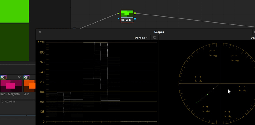
In comments from Part 2 of this series, Edi Walger embedded a video explaining why some of our patches show significant hue shifts when adding (or removing) saturation. These hue shifts affect both Saturation and Color Boost controls. About 30 seconds into his video I hit my head – the reason is simple… but you need to have the right tool displayed to see the problem (spoiler: RGB Parade).
If you haven’t watched Edi’s video yet, you may want to watch my explanation first. I talk about it in more ‘layman’ terms. When you watch his video, if you’re not a technically inclined colorist then you’ll follow along more easily. You’ll also get an interesting exploration into using an alternate color model to deal with Saturation. Try replicating his workflow on your computer. It’s an interesting exercise.
Enjoy!
-pi
Member Content
Sorry... the rest of this content is for members only. You'll need to login or Join Now to continue (we hope you do!).
Need more information about our memberships? Click to learn more.
Membership optionsMember Login


