Digging Deeper Into the Differences between Resolve's Color Boost and Saturation Controls

Understanding Color Boost in DaVinci Resolve – Part 2

May 15, 2019

We continue deconstructing Resolve's Color Boost controls, offer an alternative definition, and demonstrate how it differs from Saturation.


Series

Going ‘Home School’ to clearly define the actions of Color Boost

At the end of my original Color Boost Insight, I mentioned that I wasn’t satisfied that I had figured out when precisely to choose Resolve’s ‘Saturation’ control over ‘Color Boost’. After all, one of the defining traits of a ‘fast’ or ‘efficient’ colorist is knowing the precise differences between our tools – and when to choose one over another.

The Comments thread of my initial Insight on this topic offered additional blog posts and YouTube videos that also tackled Color Boost. Some of the linked material I strongly disagree with. But there was one comment, by Edi Walger – a visual effects artist in Argentina – linking to his blog post, Saturation, that talks about Color Boost vs Vibrance vs Saturation. Edi talks about the math behind these different operations. About Resolve’s Color Boost he writes:

The name of the parameter Color Boost brings to colorists a false meaning (also the user manual describes it wrong) about this control, [comparing it] to Vibrance, but it is wrong, since really [Color Boost does] an offset [to] the saturation values, by clipping in 0 and 100 values, like happens with Offset in RGB.

I suspect that Edi is on to something here (maybe I’ll do a follow up one day testing this in Resolve) but it’s too abstract/mathematical an observation to me. I suspect full-time VFX compositors completely understand this statement. But I’m more of an I-need-to-see-it-to-understand-it colorist and Edi’s explanation doesn’t help me answer the question: When should I reach for Color Boost rather than Saturation?

Building my own patches to understand Resolve’s Color Boost control

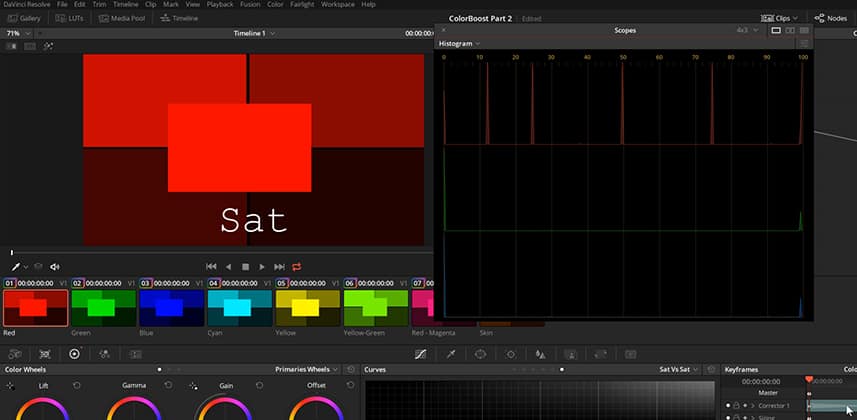
After watching a bunch of tutorials scattered across the intertubes, I decided I need to simplify my own Color Boost tests. Rather than using the various test patterns we’ve used here on Mixing Light, I decided to build my own patches. I also decided to isolate each set of test patches to specific color vectors. Doing so helped me isolate the strange hue-shifting behavior we observed in Part 1 of this series.

Premium members of the Insights Library can download the .drp file with my test project so you can look at it yourself.

Pat’s revised definition of Resolve’s Color Boost control

After the testing I did here in Part 2, here’s my definition of Color Boost (modifying what’s written in the User Manual):

Color Boost: Lets you raise the saturation of low saturation regions more quickly, and high saturation regions more slowly, than the Saturation control. This results in a more naturalistic, and often less aggressive, saturation adjustment. Can also be used to reduce saturation. Within a single Serial Node, Color Boost is processed before Saturation.

My new definition tells me two things:

  • When doing my initial balancing, I’m probably going to start with Color Boost first. It’ll saturate up a broader range of colors – helping to keep the more saturated elements from popping too quickly.
  • Resolve’s Order of Operations allows me to follow-on with the more aggressive Saturation control (if I want), without breaking it into two nodes.

Coming Up In Part 3

While researching other videos and blog posts on this topic, I came across some strange notions and workflows related to the topic of Saturation. In Part 3, you’ll learn if there’s any functional difference between Resolve’s normal Saturation control and other methods of increasing/decreasing saturation in DaVinci Resolve. There’s some intriguing advice out there that’s worth exploring – and you’ll learn if that advice is worth implementing.


Additional Downloads

Sorry... downloads are available for Premium Members only.

Become a Premium Member
Comments

Homepage Forums Understanding Color Boost in DaVinci Resolve – Part 2

Page 1 of 2

  • Scott Stacy
    Guest

    This is a very welcome insight that makes the dynamics behind saturation and color boost measurably explicit. What an awesome demonstration. I occasionally notice odd hue shifts crop up with saturation. It always “seemed” random. But now I know there was nothing random at all going on – certain plant or skin tones would start looking off while other colors would look fine. Then a tug of war process would ensue. This is very helpful.


  • Fabrizio P
    Guest

    Thank You Patrick,
    Have you tried to increase saturation in LAB color space? It seems to me that the high saturation increase more suddenly than the low saturation.


  • Pat Inhofer
    Guest

    I’ve not done this test in a LAB node.


  • Pat Inhofer
    Guest

    Thanks! I’m adding a section in Part 3 that explains where this shift is coming from.


  • Edi Walger
    Guest

    Hi Pat, Is an honour that you mention me, thanks! I have a little video explanation to share and add to this discussion, thanks again! https://youtu.be/1W1FmHWtZgA


  • Greg Greenhaw
    Guest

    does luma mix affect the results?


  • Pat Inhofer
    Guest

    I tested that theory in the upcoming Part 3 of this series. Short answer: No. Lum Mix does not affect any of these saturation tests.


  • Pat Inhofer
    Guest

    Edi – Nice! I especially like your demo of working in YUV. Well done. I’m adding the bit about channel clipping to Part 3 of this series. You’ve given me some new ideas with the YUV color model that I’ll be testing on a few jobs and eventually report back here.

    Thanks again!


  • Alastair
    Guest

    I’m late to the party as always but thank you so much for this series. This sort of thorough investigation/demonstration is worth the Mixing Light price of admission alone 🙏


  • Eduardo Santa-Maria
    Guest

    Hey Patrick Inhofer,

    This was extremely helpful. I can finally say I have a deep understanding of Color Boost & Saturation.

    I’ve had a question about timeline color space for a while, and think a breakdown similar to this would really help me understand the concept too.

    If P3 has a wider color gamut than REC709, why would you color in REC709? Why not consistently color in the color space with the most information? Also, how do regular computer monitors (iMac for example) with color space settings (Such as P3 and REC709 & REC2020) stack up against professional coloring monitors?


  • Morgana
    Guest

    Very helpful Patrick, thank you! I can’t seem to find Part 3 in the ML Library. Was Part 3 of this insight ever completed?


  • CHRISTOPHER F
    Guest

    Patrick, I’m really confused about your use of histograms. I’ve been using them for years with the understanding that they are indicative of luminance. The higher the peak, the more pixels at that luminance level. There is no way to interpret saturation from histograms, any more than you can from a waveform (outside of ninja-level interpretation of each RGB graph against each other). I’d be shocked, but also very interested, to find out that I’m wrong about this.


  • CHRISTOPHER F
    Guest

    After doing more of a deep dive on this, I’ve discovered that the vectorscope displaying YCbCr video calculates saturation much differently than the HSV or HSL color models I’m used to thinking in, where saturation is basically just a ratio of the highest and lowest color channel values.

    I now understand that you were using the histogram’s luminance information as a kind of proxy for the saturation values in the image. I’m having a hard time finding a good explanation of how a vectorscope calculates saturation, but it appears to take luminance into account, meaning that the color channel differences must be contributing to the saturation value in an absolute way, rather than via a ratio.

    For example, if you take the two red colors (255, 0, 0) and (63,0,0):

    1) In HSL, for both colors the ratio between the highest and the lowest channels is infinite, so the saturation is 100%
    2) On a vectorscope, the bright red appears to also be 100% saturation, but in the second color, the absolute difference between the red value and the lowest value is only 63, so the saturation calculation returns a lower number (though I’m not sure it’s 25%, which you would think if you were looking at the histogram as if it were displaying saturation values.)

    So, though the histograms in your example do show peaks which correspond to different saturation levels, I still think that using the histogram in this way is confusing, because it does seem as though you’re pointing at saturation values on the histogram which are actually showing luminance values.

    I’d also love to hear if you have any thoughts on how to learn more about how saturation is calculated in video. I can’t find a good explanation anywhere.


  • Robbie Carman
    Guest

    Christopher –

    Sounds like you got some of this on your own but let me go a little further and clarify a few things (hopefully). Some of this goes much deeper and relies on some in-depth color science and some it is just more how Resolve works I’ll keep this to a high level.

    —-

    Indeed, you are correct that a histogram shows a statistical measurement of pixels at different parts of the tonal range (visualized as digital percentage or code values depending where you are looking at one) and yes, in practice, a histogram can be used as a way to evaluate black point, white point, contrast ratio and like a parade, color balance. So in practice, your understanding is correct and it’s a common way of thinking about a histogram.

    BUT….it’s not really correct to say ‘luminance level (Y)’ in reference to a RGB histogram like Patrick shows in the video.

    Take the following example (and you can do this on your own). Load up some color bars, here I have a set of HD bars (a resolve generator). Then bring up the scopes and in a 2-up view set one to an YRGB histogram and the other to a Y only Waveform (no colorization, Y Only). You get something like this.

    https://uploads.disquscdn.com/images/

    Obviously on the Y only waveform you’re seeing a line for each patch on the color bars and a diagonal line for the b/w ramp. You’ll see the same thing on the Y histogram and also notice you have some RGB peaks that are the same, indicating equal distribution of RGB which of course equals white – the white patches on the color bars.

    Now take the saturation slider and drag it down to like 30. As you drag you’ll notice the Y only Waveform and the Y only histogram don’t really change (they wobble slightly due to the non-linearity of the EOTF in the working space) but for all intents in purposes they don’t change.

    But what does change is the distribution of the RGB histogram plots. Seemingly out of nowhere Red, Green and Blue spikes have appeared as you changed the saturation because the distribution of RGB pixels making up each colored patch has changed. Furthermore you’ll still notice that the black and white patches and their YRGB spikes are still in place and equal.

    https://uploads.disquscdn.com/images/

    Another point about all this is that’s is pretty easy to calculate BT/709 relative luminance value by using the formula (keep in mind its gamma weighted hence the ‘ symbol:

    Y’= .2126R’ + .7152G’ + .0722B’

    So take a 100% red field in 10-bit values – 1023,0,0

    (1023 x .2126) + (0 x .7152) + (0 x .0722) = 217.4898

    This result is 10-bit digital code value which correlates to the 10-bit code value graticule of the luma waveform

    https://uploads.disquscdn.com/images/

    Changing saturation, just like last time, doesn’t change the luma value of that red, it simply changes the distribution of RGB values. Or said another way it changes the RGB triplet values as you can see in this screen shot (I started with 1023,0,0).

    https://uploads.disquscdn.com/images/

    This is a long about way of saying an RGB histogram is not showing gamma weighted luminance (luma) a YRGB histogram can by viewing the Y channel. A RGB histogram is simply viewing the distribution of values in the tonal range.

    Again in practice – I don’t think you’re really wrong in how you describe using it day to day. I just want to make the point that the RGB plots are NOT showing luma (gamma weighted luminance) – that’s the job of the Y only histogram plot or the Y only Waveform, or the Y only channel in a YRGB Parade.

    In the video Pat could have made this distinction and I would make the argument the use of saturation is probably not the correct term (so good call on that). But as you point out its a good proxy to see the closely related idea of RGB distribution

    Two last things to consider.

    While flat scopes are easy to look at and we are all used to them, they don’t show things volumetrically in the space that you’re working. In reality when making adjustments your moving pixels within a space that can be visualized in a 3D model (XYZ axes). I think a lot of this which scope to look at stuff could be minimized with better volumetric scopes.

    Volumetric graphs/scopes are popular for display characterization like here a screen Volumetric CIE scope from Colourspace:

    https://uploads.disquscdn.com/images/

    They’re also getting popular in scope apps. Here is a slightly different approach but the same idea from Omniscope:

    https://uploads.disquscdn.com/images/

    I just think a volumetric approach give you a much better idea of the relationship of where color sit (chromaticity) and how ‘bright’ they are. In other words, once you get your head around them its really easy to see ‘bright red’ or ‘dark blue’ etc

    Resolve in particular can give you a headache because of the default YRGB color science. You allude to this in your second post – yes there is relationship! Using grading controls like Lift Gamma Gain will effect both saturation and luma at the same time. You can modify this behavior with Luma mix which you want to read up on.

    Sorry for the novel in reply!


  • CHRISTOPHER F
    Guest

    Thanks for the quick response Robbie! I guess I got a little taste of my own medicine, as far as my use of the term ‘luminance’ goes in regard to a single color channel. 🙂

    Something that also struck me, and maybe it has no bearing, is the fact that the HSV or HSL color encoding has saturation as an inherent part of the definition of a color, whereas one must derive a saturation value from a color encoded as RGB or YCbCr.

    Another thought I had about why I found this use of the histogram confusing, is this:

    https://uploads.disquscdn.com/images/

    Similar spikiness in the red channel, but zero saturation across the board. So using the histogram values as a saturation proxy only (sort of) works in this exact situation where the other color channels can be ignored.

    In the end, I guess I’m one of those people that doesn’t feel like I understand something unless I understand it from the ground up. I definitely do not understand this deep color science stuff from the ground up. So, I’m still wondering the best place to start in understanding the real nitty-gritty of this topic. I’ve been growing my understanding here on Mixing Light, but it does seem like you want to keep things higher level (as that’s what most people want, I get it!). I’d love suggestions on resources that can help me go from zero to hero in the color science realm!

Page 1 of 2

Log in to reply.

1,000+ Tutorials to Explore

Get full access to our entire library of over 1,100+ color tutorials for an entire week!


Start Your Test Drive!
Loading...