| Series |
|---|
Color Warper 101 Part 3: Bringing It All Together to Create Looks
In the first two parts of this series, we took an in-depth look at all the tools in the Color Warper panel new to Resolve 17.
Now, in our final installment, we’re going to put it all together to create some great looks!
The Color Warper is incredibly powerful for this kind of work, providing an intuitive interface to place scene colors at specific hue, saturation and luminance values. It’s built to create smooth transitions between these color manipulations, so it’s great for creating both extreme and nuanced looks.
It’s my hope you’ll walk away with a solid understanding from this Insight, and from the entire series about how to use and get creative with this powerful tool. The Color Warper has scratched a creative itch for me and I’m hoping it will in you too! And at the end of the video below, I’ve got a grading challenge for everyone! I can’t wait to see all your looks in the comments section!
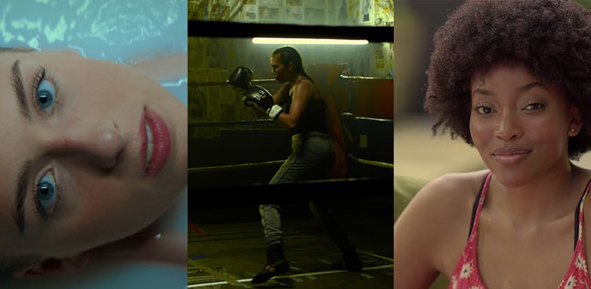
Simple Teal & Orange, Gritty Yellow-Green & Subtle Golden Hour Looks
To show off the versatility of the Color Warper, we’re going to create three different looks: a take on the classic Teal & Orange split-tone look, a gritty Yellow-Green look, and a more subtle golden hour look.
The goal is to create a compelling feel for each of these shots while maintaining good skin tones & other key colors. Thankfully, the Color Warper makes this easy!
My Approach to Color Warper Look Creation
Along the way you’ll learn my basic approach & order of operations in the CW that help us refine the look-creation process:
- Place & pin your target colors in the Hue & Sat panel
- Shift your neutrals towards the overall color tonality you’re looking for
- Make small adjustments to any out-of-place colors or hue-vectors
- Switch to the Chroma-Luma panel to dial in the look with specific luma adjustments in certain hue ranges or hue shifts at specific luminance ranges
A Grading Challenge!
Now that you know what the Color Warper is all about, we want to see your looks created with this amazing tool! Download the clips that I used (links below) and get to work!
Create as many looks as you want. You can use other tools to set your exposure, contrast & overall tonality, but limit your ‘color’ manipulations to the Color Warper toolset. As your ‘client’ I’m open to any and all interesting or creative looks, with only one word of guidance: ‘refinement’. It’s easy to push colors around in the Color Warper, but can you make the image sing?
Post stills to the comments section, and we can discuss them. I can’t wait to see what you come up with!
BRAW Media
The clips below are available for free from Blackmagic Design:
The Fighter – Punching in the Ring
Comments & Questions
As always, leave your comments & questions in the discussion below!
-Peder
Member Content
Sorry... the rest of this content is for members only. You'll need to login or Join Now to continue (we hope you do!).
Need more information about our memberships? Click to learn more.
Membership optionsMember Login


