Learning to Color Balance More Quickly With Fewer Adjustments

October 4, 2022

In the final episode of his 'Flexing Fundamentals' series, Cullen Kelly shows how to color balance more efficiently by thinking differently.


Series

Flexing Fundamentals Part 5: Color Balancing Operations

In this final Insight of this Flexing Fundamentals series, we’ll look at the key principles and techniques I like to keep in mind when balancing images. This balance might be corrective in nature — e.g., neutralizing a green cast in the footage — or creative in nature — e.g., adding a push or wash of warm color.

Either way, one of the ideas I find most helpful for optimizing my process and my results is to confine myself to two dimensions rather than three. This idea can take different forms, and we’re going to explore two of them today.

Key takeaways from this Insight

By the end of this Insight, you should have a solid understanding of:

  • Using the vectorscope “X” technique to more easily evaluate balance
  • Thinking not only about red, green, and blue, but also cyan, magenta, and yellow — and the benefit of choosing and manipulating just two of these
  • Why too much freedom in color grading can be paralyzing, and why limitations can set us free

Related Insights

Questions or thoughts? Leave a comment!

Is this Insight useful to you? Let us know! Mixing Light thrives on feedback, and we’re wondering if you found this helpful or if you have more questions we need to address?

– Cullen

Member Content

Sorry... the rest of this content is for members only. You'll need to login or Join Now to continue (we hope you do!).

Need more information about our memberships? Click to learn more.

Membership options
Member Login

Are you using our app? For the best experience, please login using the app's launch screen


Comments

Homepage Forums Learning to Color Balance More Quickly With Fewer Adjustments


  • Jim Robinson
    Member

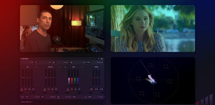
    Hey Cullen – once again, really enjoyed this series. I love the four screen zoomed in windows you had in this one with you in the corner and your primary bars below, and on the right the image with the scopes below. I fond with all these new high res screens that people use that in a tutorial I’m squinting sometimes to see exactly what is happening. So thanks for doing that edit to this insight. It made it a pleasure to watch.


    • Patrick Inhofer
      Administrator

      Jim – Thanks for that feedback on the tiled windows. Our Contributor, Arthur Ditner, edited this Insight of Cullen’s. I’ve given instructions to our editors to try different ways of presenting the UI, and I also loved how Arthur did this. I’m glad to hear you agree.

  • What a perfect topic, real fundamental, bread and butter colour grading! Decades ago, when I was taught how to line up old studio cameras, I was told to set the exposure and then leave the green channel alone and only balance with the blue and red. Part of the logic being that you could accidentally make similar adjustments to all three channels and you end up just where you started only darker/lighter – so it makes sense to pick one channel and move the others around it. Green is 70% of the luminance so leave that one alone.

    I’ve recently been sat in front of a Resolve Advanced panel and, once I have my look and fixed node graph in place, the majority of what I’m doing is printer light hotkeys on a standard keyboard, 7 & 4 (red/cyan) and 9 & 6. (blue/yellow).

    Thanks again for this series. I also really enjoyed your chat at ResolveCon with Daria, Darren and Casey, very insightful!


    • Cullen Kelly
      Member

      Thanks Jamie! Great insights and wisdom re grading “around” the green channel!

      And glad you enjoyed the ResolveCon panel!


    • Ethan Thomas
      Member

      Have to agree here. Definately prefer the hot keys over the trackball for offset. My main reasoning for reaching for the keys is that when working in steps, your eyes dont have time to adjust while making the adjustment. So it’s easy to see when you’ve pushed it a point too far. I find when making fine corrections using the trackball/dials it can be easy to go off track as your eye slowly adapts to the adjustment.


      • Cullen Kelly
        Member

        Makes sense Ethan! I go back and forth, as I do feel the ideal adjustment would be feel-based rather than mechanical, but getting nuanced and controlled adjustments can be tricky when using the trackball!


  • Marco Paba
    Member

    • Patrick Inhofer
      Administrator

      Marco – Nice link! 🙂


  • Cullen Kelly
    Member

    Oldie but a goodie Marco!


  • Clement
    Member

    Offset is my Favorite tool. Simple and very effective for balance.

    Trish Cahill (The Hobbit, The power of the dog) taught me how to use it.  🙂


  • Cullen Kelly
    Member

    Love it Clement!


  • Rich Marino
    Member

    Simplifying with not only printer lights for balancing but also only manipulating 2 colors is a excellent perspective I hadn’t  thought of, thanks for a great series!


    • Cullen Kelly
      Member

      Sure thing Rich — glad you found this useful!

Log in to reply.

1,000+ Tutorials to Explore

Get full access to our entire library of over 1,100+ color tutorials for an entire week!


Start Your Test Drive!
Loading...