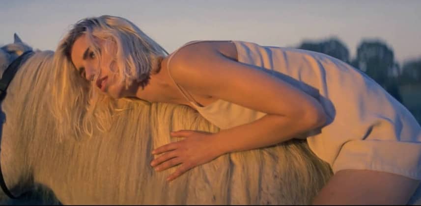
Basics Contrast

Rediscover The Basics – Contrast

January 14, 2015

Its tempting to dive in with many nodes & advanced techniques but spend more time getting your contrast right & you'll love the results


Series

Thinking about how to approach the foundation of every Look

Next up in my series on rediscovering the basics is to take a look at contrast.

In my opinion contrast is the most important part of creating the look.

You can take an image to a extremely bright and zingy direction, low contrast milky direction or a natural cinematic look all with just the contrast levels.

In the insight below you’ll see my different thoughts and approaches to contrast.

We’ll take the same clip as before and try and create as many different feels as possible by just adjusting the contrast.

Here is the full versions of my two reference clips :

‘Destination’ – DubVision & Feenixpawl

‘Destination’ – DubVision & Feenixpawl from Jake Scott Cinematographer on Vimeo.

This video was shot on 35mm film and has a very natural look. I use it as a nice reference when trying to emulate film. It doesn’t have to be a heavy crazy look to feel filmic!

PHILIPS – HUE

This is a reference look for a few different contrast levels across different eras. The modern look was pushed to be a nice and shiny feeling.

My Thoughts

I always start with a reference image in mind. Browse the web and find 5 different photos you like and try and match the contrast.

I find I get my best looks from the most unexpected reference images!

Check out my insight below to see how I got on.

– Dan

Member Content

Sorry... the rest of this content is for members only. You'll need to login or Join Now to continue (we hope you do!).

Need more information about our memberships? Click to learn more.

Membership options
Member Login

Are you using our app? For the best experience, please login using the app's launch screen


Comments

Homepage Forums Rediscover The Basics – Contrast

  • The insight video seems to be missing. Is it not linked after the relaunch or could it be a problem with my browser?

  • Anybody?


  • Dan Moran
    Member

    Hey Anton! Sorry about this I’ll get this moved over right now. Sorry about the delay.


  • Dan Moran
    Member

    All fixed now! Thanks for finding this for me.

  • Thanks Dan! No problem!


  • Todd
    Guest

    I’m sorry, but I really don’t find this sort of tutorial to be worth paying $24 a month for. You don’t even use the scopes to figure out if you’re really clipping or not, or to adjust the lift? It seems like you’re just ‘winging’ it – try this, try that, a little of this – and all on the curves. How about contrast between midtones and highlights vs contrast between midtones and blacks, and how to accomplish that?


  • Dan Moran
    Guest

    Thanks for the feedback Todd in general I agree with you and of course I understand the importance of scopes and how they can guide one in grading, and understanding issues like clipping as you mention. I also understand how the insight might feel like I’m winging it…I’m not. One theme of this series was for placing emphasis on the visual side of things and to challenge colorists really learning ‘how to see’

    I probably do take for granted my ability to see things like clipping in the image etc. and I’ll try and reference scopes more in upcoming Insights. I’d also love to record a new insight based on your question about mids and highlights vs mids and blacks contrast.

    Is there a particular scenario / camera format you’d like me to focus on? It just helps me focus on the right sample footage and solution. Making something shot well on a great camera look more stylized is a totally different approach to fixing something shot badly on a difficult camera format etc..

Log in to reply.

1,000+ Tutorials to Explore

Get full access to our entire library of over 1,100+ color tutorials for an entire week!


Start Your Test Drive!
Loading...