Nominations 2018

British Arrows Best Colorist Nominations 2018

April 21, 2018

Dan Moran shares his thoughts on the best commercial color grade nominations 2018. Top work from excellent colorists are great sources of ideas.


Series

Get inspired and find a creative spark from top colorists

The most prestigious grading awards here in the UK has just announced it’s Best Colorist Nominations 2018, so I’d like to take you through them and discuss my thoughts – and hear yours.

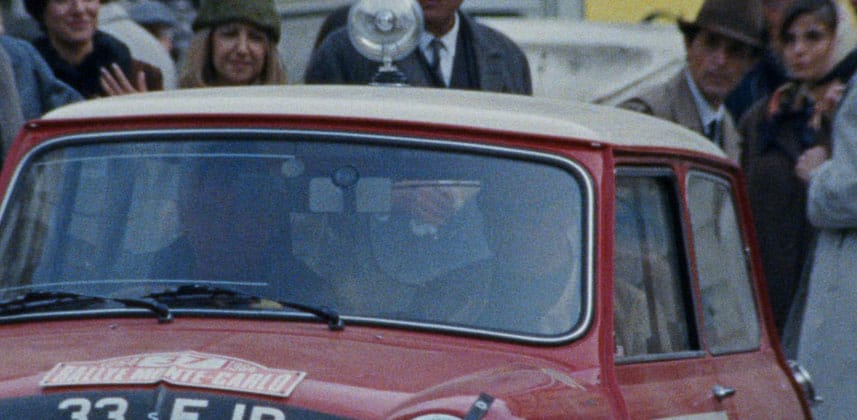
This year we’ve taken a very clear turn back to retro styling and either shooting on film or emulating film.

The 2017 nominations featured lots of clean modern style “digital” grades. This year’s nominations are almost an inverse of that style selection and see softer images, with filmic contrast and 35mm style colour as a clear statement of stylistic choice.

As always, I love to try and guess the winner and would love you to do the same.

Once you’ve watched all entries please do comment below on your favourite and why you think it should win.


Member Content

Sorry... the rest of this content is for members only. You'll need to login or Join Now to continue (we hope you do!).

Need more information about our memberships? Click to learn more.

Membership options
Member Login

Are you using our app? For the best experience, please login using the app's launch screen


Comments

Homepage Forums British Arrows Best Colorist Nominations 2018

  • Breakdown and emulation would be really cool.


  • Joshua Howey
    Member

    Could you please let us know where your insight on yellow highlights is? The newer members would love to know. Thanks!


  • Dan Moran
    Member

    Sorry sir! That should have been in there . You can find it here https://mixinglight.com/color-tutorial/from-the-grading-room-is-yellow-the-new-orange/


  • Willian Aleman
    Guest

    I second that!

  • Yes Please Dan, let us watching you trying to replicate those looks!


  • Ron Illingworth
    Guest

    The UK seems to have a healthy fetish for old-timey Hollywood Romance (and the Lacoste and Debenhams pull it off very well)!

    For me, it’s a toss-up between Diesel and Debenhams. I reacted differently to the Diesel ad’s use of Film scratches and dirt…to me the “laid-on-top” artificial look of these fx seems stylistic and make the image feel more modern than if it was just mimicking an organic film texture. I enjoyed it.

    Just my two cents CDN!

  • Yeah, would love a little insight.

  • I always love seeing how these looks are broken down.


  • Don Hertz
    Member

    I’d love to see some breakdowns too.

Log in to reply.

1,000+ Tutorials to Explore

Get full access to our entire library of over 1,100+ color tutorials for an entire week!


Start Your Test Drive!
Loading...