| Series |
|---|
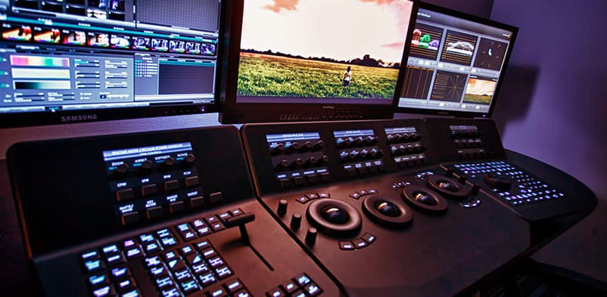
Rooms, Furniture, Lighting – Grading Suite Building Blocks
We spend so much time on here on MixingLight, or on Twitter, Facebook and of course in the pub discussing tools & techniques that help create beautiful images.
Those discussions are obviously really important, but it might surprise you that the most common question(s) that we get on our contact forms, on social media, or in person at conferences and industry events has nothing to do with creative use of curves, or how to manage a complex node tree.
By far, the question(s) we get the most have to do with how to build a proper color grading suite.
Here is a small sample of recent questions:
- Can walls in a room be any shade of gray?
- What does a monitor backlight do?
- What’s the best viewing distance to my monitor?
- Where should I set up my client monitor?
Recently, on a weekly conference call, Team Mixing Light couldn’t believe that we hadn’t covered suite setup in and things to consider in a build out in detail!
This topic has also been on my mind, as in the next month or two I’m starting construction on a new suite at my facility (and looking forward to it)!
Well, let’s get started with this first Insight in the series about configuring a proper full-time color grading suite.
Just keep in mind one thing throughout this series – while I’ll reference projection setups from time to time I’m almost exclusively discussing rooms with direct view monitoring.
At some point in this series, I plan to have a colorist friend of mine who works every day in a grading theater, chime in regarding suite setup for that environment.
What Size Room Works Best?
Unless you’re starting with a completely blank shell of a building or floor, or if you have the ability to do some demolition and construction work, you’re probably going to have to start with a pre-existing room.
While any room with four walls can act as a suite, you need consider the size of that room before anything else.
These days, it seems many companies have edit rooms about the size of a broom closet (or smaller)!
While a tiny color room might work if you’re never supervised, most colorists are supervised frequently – some just review sessions, others like Dan for example, everyday with two, three or sometimes even 10 clients in the room at once! Yikes!
Here is how I think about how big a color suite should be:
- What kind of work are you doing?
- How many people do you usually have in the suite?
- How long do those people usually stay in your suite?
- Do clients simply sit and watch a project or are they also working?
If you’re doing mainly theatrical work that requires projection then obviously you need a pretty large room – maybe even approaching true theater size. If you’re doing other types of work you can usually get away with a smaller sized suite.
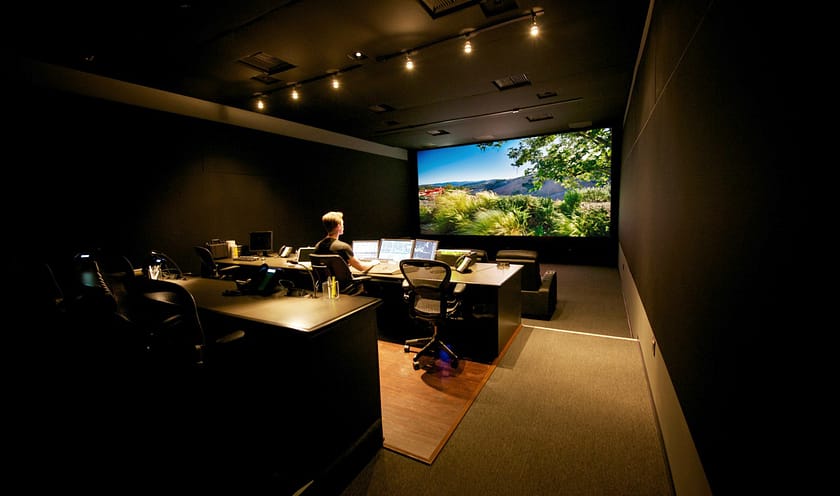
Typically, I usually have 2 people in the suite – a director/producer and DP.
But I like to plan for a capacity of 2x-3x times that, which means I might need to fit 7-8 people (including myself) in the room – each with a comfortable seating position- the last thing you want is to have to drag in chairs from other rooms and have people squirm because they’re uncomfortable.
Length of stay and what clients will be doing in the room also play an important factor for how large the room needs to be.
If your clients are in the room with you from 8am till 6pm regularly, then you’ll need a comfy place for them to sit – like a couch or armchair, but probably also a desk and office chair where they can sit and get work done – things like phone calls, emails, etc.
The more varied the seating setups the larger space you’ll require.
After nearly 20 years in suites of all sorts here are some general guidelines I can give in terms of size:
- You and 2-3 clients – 125-150+sqft
- You and 3-6 clients – 175-200+sqft
Remember, add to those base numbers if you’re need to have a workspace for an assistant, client work, or watching and relaxing space.
In all the different buildings and different suites I’ve worked in, I’ve never once thought “this room is too big”, but I have thought many times that a room is too small. Err on the larger side.
Room Construction & The Window Question
Unlike an audio mix room, color rooms don’t nearly have the same acoustical needs – floating floors and ceilings, double/triple insulated walls, super heavy doors, etc.
But some consideration should be placed on the dimensions and layout of the room to not only help it sound good, but isolate it from what’s going on in the rest of the facility.
If you have the ability, having a room that’s not perfectly square or rectangular or better yet minimizes parallel walls will help it ‘sound’ better.
And while clients often accept that they’re in color room, and not a mix suite, having isolation from the outside world (and shielding your co-works from your room) is an important consideration.
While there are many ways to achieve that isolation, here are some considerations:
- With new construction use the thickest drywall available or better yet double/triple drywall – drywall > air or insulation > drywall. You don’t have use very expensive de-coupling setups like an audio room, but this type of construction is amazingly effective and can be done in a cost-effective way.
- With existing construction if you can gain access to the inside of the wall putting in sound deading insulation is a cost-effective way to make a room more sound friendly. A friend recently used recycled denim for insulation in her color room – works great!
- Avoid stone, concrete, and other highly reflective surfaces on the interior of the room. While the industrial look is all the rage these days (and helps with isolation, it causes all sorts of problems in the room. If you do want that look, be prepared to install other sound shaping measures.
When it comes to the floor of the room – I prefer carpet, but if pergo or something else is to your liking just be sure to get some area rugs to deaden reflections in the room.
Drop ceiling is great and helps with the sound of the room. If you have concrete or drywall you may want to consider some sound absorption panels placed on the ceiling with liquid nails.
What about windows?
As you probably already know, ambient light control is something that is vital in a color suite, but that doesn’t mean that ambient outdoor light is a horrible thing, but controlling it is vital.
There are really two schools of thought when it comes to windows in a color suite:
- School of thought #1 – Avoid windows altogether! If a room can be centrally located in an office space with no windows…perfect! Why manage ambient light when you can create a perfectly dark room!
- School of thought #2 – ‘I’m not a vampire, man!’ Getting some sun is a good thing, not only for your mood, but for vitamin D production. Besides, it’s nice every once in a while to see what the weather is like. Furthermore, people don’t usually watch TV in a blacked out room, so a little ambient light can help replicate a typical viewing environment.
I’ve been in rooms run by some of the top colorists in the world and there were windows! I promise it’s true!
Again, windows shouldn’t be a bad word in color suite design.
The key to having windows in a room is having control over the incoming light.
Blackout curtains/shades are probably the most common and cost effective method for controlling incoming light, but I’ve seen other methods employed such has covering windows with wood (usually painted black) to make the room light proof, putting large floor standing screens in front of the windows when light needs to be blocked and so on.
While my current room and the room I’m about to build will not have windows, I’ve used these products in the past to great success – Black Out Curtains , Shades
Surround & Wall Color
Just go search one of the popular postproduction forum websites and you’ll see a lot of questions (and comments) about the wall color in a grading suite.
You might even find some very opinionated comments made by me over the years!
As you probably know, having bright red walls, or rainbow colored pictures right in your field of view will impact your color perception and change the way you grade.
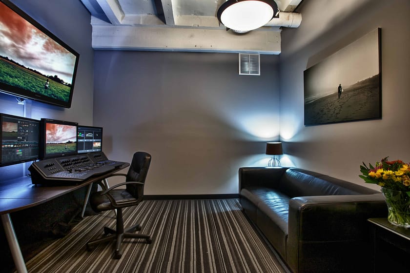
As a general rule, that’s why colorists are always talking about have gray, neutral walls in their grading suite.
But what does a gray wall really mean?
18% Gray
There are some that subscribe to the idea that the perfect gray for a wall is the so-called 18% gray or middle gray that you often see on photo white balance cards.
Remember, 18% gray is not really 18%, that number means that the wall is 18% reflectant.
Perceptually a 18% gray wall is about 50% gray – between pure white and pure black.
Many folks simply get a nice X-Rite gray card and take it to a paint shop to match.
While this is not a bad approach, I’ve personally not had good luck with it as the match is never all that close and the resulting paint formula tends to be a little cool (color temp wise).
Munsell Calibrated
There are some that get even more geeky about wall color (me included!) and use Munsell gray scale values to define what the gray should be.
N5 would be middle gray with N6-N8 probably being a little more common.
I myself I have used N6 as my standard reference for a decade as I find N5 to be too dark in the dark lighting environment of a typical grading suite
The thing about true Munsell calibrated paint is that it shows absolutely no hue bias when properly prepared and painted and for someone with O.C.D. like me that’s a good thing!
Where To Buy?
So where do you get this calibrated paint?
A better question is do you want to spend a lot of money for perfection or is close enough ok?
If perfection is what you seek then many photographic suppliers have Munsell calibrated gray paint. I’ve been buying calibrated N7 paint from RP Imagining for years. This paint is as perfect as it gets.
It’s spectrally flat, easy to paint on water soluble latex paint (easy to roll). The downside it’s $90/gallon PLUS shipping!
If that seems like overkill, there are quite a few formulas you can find on the web for ‘gray paint’ suitable for a color suite.
Our pals over at FSI have a formula for Behr paint that you can get at Home Depot. I’ve used this formula for my home suite it’s surprisingly good.
If you do end up going with an ‘off the shelf’ DIY gray paint solution, get a sample first and view it under different lighting conditions.
I’ve found many ‘gray’ paints to be rather blue when they actually get up on the wall.

The Whole Room?
One bit of confusion about paint in a color suite is that many assume that the entire room needs to be a neutral gray.
While it’s certainly ok to paint the entire room gray that’s not really necessary – after all that’s kind of boring!
The most important part of a wall to have neutral is your surround. Meaning the area behind your monitoring and in your peripheral vision.
While I wouldn’t advocate going for the loudest lime green you can find for the rest of the room, a splash of color here and there outside of the surround is not a bad thing.
Furniture
Just like in your home, furniture choice in a grading suite is a very personal choice.
If you’d like a hand carved single piece redwood desk recovered from an old barn in northern California for $8k knock yourself out!
Rather than tell you exactly what to get, I want to share some thoughts on what to consider with furniture in your room.
Feel & Mood
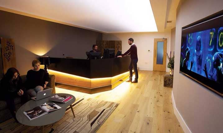
Furniture says a lot about a space. When it comes to a grading suite it can give an impression of the room being highly technical or highlight creative.
Racks of gear, the latest high-tech looking edit console, and Herman Miller seating for everyone says one thing, whereas a rustic looking desk, comfy couches and funky throw rugs say something else.
Look and functionality also affect the feel and mood of suite. Cables everywhere, wobbly chairs, and stained upholstery send one message to a client where a clean well organized room sends another.
Your Desk
Whether you get a custom AKA Design console or you buy a nearly disposable table top from Ikea, your desk has to be all about ergonomics and functionality.
Here are some things to think about:
- Is there enough space for your keyboard, control surface table and mouse?
- How many monitors can you place on the desk? Can your UI, Reference Monitor and maybe a scopes monitor (or 2nd UI screen) all fit?
- Can you position your monitors so that you’re not straining (looking up or down or left and right all the time?)
- Does the desk have cable routing options? Better yet, can you hide cables behind & underneath the desk so they don’t look so messy?
- Is the desk adjustable in anyway?

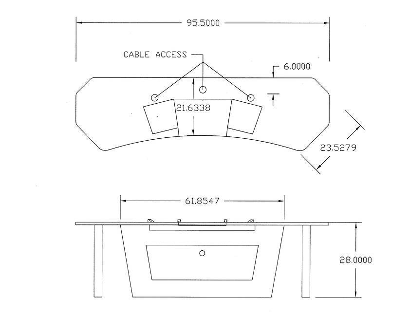
I’m currently working with a designer for a hand cut oak desk were my Resolve Panels are inlayed in the desk and the keyboard pulls out.
Additionally, below the desk I have a trap door to hide but also access cables and not shown in the diagram below is a monitor bridge to accommodate three monitors.
I’ve been asked a lot about what I think about a standing desk in a grading suite.
Let me say that I have a standing desk at home and I love it! But I don’t think I’d want one in the suite. It’s just a personal preference. If you’re using a standing desk in a suite, I’d love to hear about it in the comments below!
Your Chair
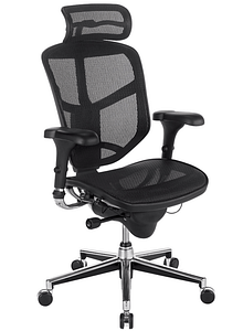
Buy the best, most comfortable, most supportive chair that you can. DO NOT SKIMP. END OF STORY.
Here is a great article on proper ergonomics for seating.
Client Seating
When it comes to client seating I like to offer a few options.
First and foremost is comfy seating.
Couches, armchairs that are comfortable and stylish are great. Avoid bean bag chairs and futons, this is not your kid’s rec room!
This might sound strange, but I don’t want the comfy client seating to be so comfortable that the client never leaves!
While still trying to be comfortable, I go for firm surfaces rather than ‘body melts into’ type cushions.
I also tend not to have a place where a client feels like they can just put their feet up – so soft ottomans are usually a no-go replaced with a coffee table topped with art books and magazines.
In general, I want this area of my suite to feel like a stylish living room – approachable & comfortable, but also a space where work can be done and the client doesn’t slip off into a nap while I’m grading a difficult scene.
The other type of client seating and area that you need to consider is workspace – meaning a small desk and chair(s).
Should the client need to spread out with notes, pull out their computer or a drive, you want them to have the space to do that without slouching on a couch.
Assist/Secondary Working Area
If you have the room, one last thing to consider is a workspace area for an assistant or a secondary workspace for you – a render station for example.
If you have a very large console this could simply be an iMac or laptop at one end of the console with another chair.
Client workspace could also be used for this purpose. In my suite, I have a separate little area in the room off to the side. This way an assistant can be conforming or rendering while I’m working with the client and the assistant is not disruptive.
Miscellaneous Items
My personal preference for a suite is that it feels like a living room and looks nice and comfortable.
Because of this, I think there are other furniture type items that one should consider:
- Tables – end tables, coffee tables, etc. Essentially somewhere for you or a client to put down a drink, rest their iPad, etc. Buy lots of coasters!
- Art & Pictures – I’m not a subscriber to the idea that a color suite is a perfect gray box! As long as pictures and other artwork are not in your surround, put them on the wall! As I mentioned earlier a little splash of color makes for a nice room. If in doubt – black and white photography is always a classy way to add some character to a room without ‘polluting’ the room with color.
- Sound Shaping – Depending on the design of your room you may need to do a little work to get the acoustics of the room a bit better. Sound absorption panels, bass traps, and diffusers don’t have to look bad. Indeed, many companies make patterned ones or even custom printed versions to fit your style and decor.
- Lighting Fixtures – I’ll talk more about specific lighting setups a bit later in this Insight, but you should consider additional light fixtures in your room. The style of these is really up to you – it could be track lighting, table lights or even a standing fixture. In general, just make sure the design of the light does not cast direct light onto a monitor, or some other critical part of the room
Remember, while you want your suite to look as nice as possible there is the concept of diminishing returns. A $10,000 desk might look amazing but could $8k of that have been spent for a better computer?
Lighting
Just like controlling any ambient light is essential in a grading suite, so is the lighting in the room.
Like having to color grade a mixed lighting scene can be difficult, trying to work in a mixed lighting setup can be equally if not more challenging.
Here are some general thoughts about suite lighting:
- 6500k Everywhere – no matter the light fixture, everything in the room should be the same color temp – 6500k. Having the same lighting everywhere will keep you from creating a mixed lighting environment and competing with the white point of your monitor.
- High CRI – CRI or color rendering index is a measure of the quality and repeatability of the lighting color. The higher the value the better. For a color suite, look for values of at least 90 but the closer you can get to 100 the better.
- Same Bulb Manufacture – even if you have bulbs with the same specs, different methods of creating those bulbs (formulas) can lead to differences. I tend to get bulbs from the same manufacturer in the same series or line and use those throughout the suite. My current favorite bulbs are from Philips for general suite lighting.
- Fixtures Matter – Especially if you want to dim (check that bulbs are dimmable). Look for high-quality fixtures & ballasts.
- Controllable Direction – With all lighting in your suite you want to be able to control its direction. Light spill onto monitors is not good!
Of course, besides these general tips, position and intensity are other key things to consider. I tend to go with the wide and low approach.
What I mean is that I tend to put lighting on the edges of the suite at seated shoulder level and have it rather low intensity (10-20% of my peak white monitor output).
If you’re buying CCFL or LED type bulbs remember the wattage is not equivalent to traditional candescent bulbs. A CCFL with only a couple watts of output is usually quite a bit for a grading suite.
One more thing to discuss when it comes to suite lighting (and I’ll be sure to cover this again in the next part of this series) is your monitor backlight.
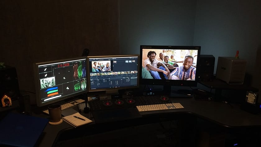
Also called a surround light, this light has a couple purposes, but the main purposes are reducing eye fatigue from your monitors and helping improve perceived contrast of what you’re looking at.
If you have never used a backlight you don’t know what you’re missing!
Backlights can come in different sizes – some attach directly to the back of the monitor, others are floor mounted. Others still are dimmable or at least have baffles to control the light direction.
I’m a huge fan of the products from CinemaQuest (FSI sells these too). I use the Ideal Lume Pro fixtures and lights behind my monitoring (client monitor too).
The Ideal Lume Pro fixtures/bulbs are pretty pricey, but to be honest I’ve never found anything better.
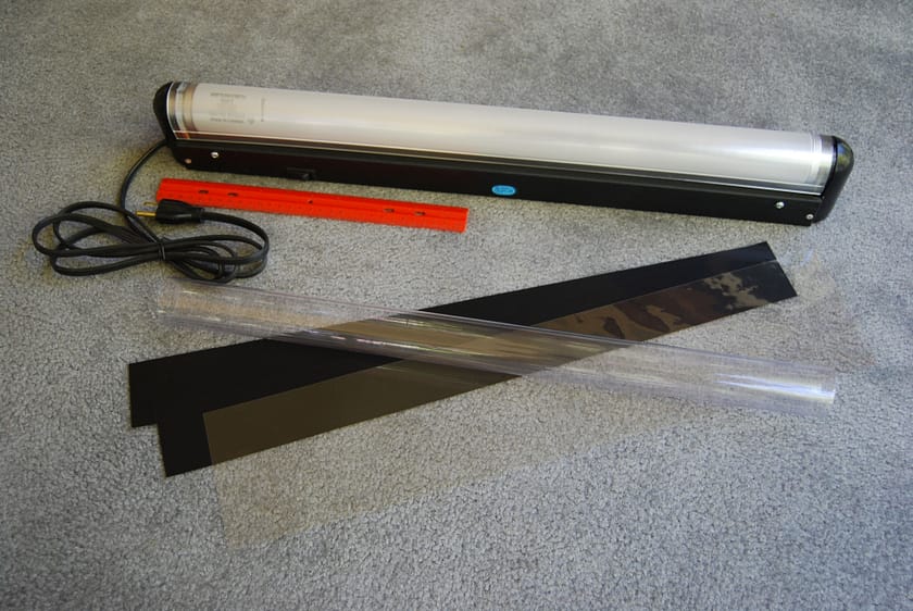
In the next installment of this series, we’ll discuss in more detail how to properly setup a backlight and where to position it.
About all those cables!
I hate that my O.C.D is showing through so much in this article, but I REALLY HATE cable clutter.
Nothing makes my skin crawl more than seeing a rat’s nest of cables on the ground underneath a desk.
A neat and tidy presentation is key to having a suite feel high-end.
Spend some time to organize and manage cables and to that end here are some tips:
- Label Cables – If you can write directly on the cable that’s great, if not, I’m a big fan of small address labels. Be sure to label both ends of the cable and if you’re like me the middle too!
- Cable Ties Are Your Friend! – I’ve never met a cable tie I didn’t like. Grouping and tieing cables together is a great way to keep things tidy.
- Conduits & Cable Channel – If you need to run cable along a wall or across a room trying to use the perimeter of the room to keep things clean. I really like paintable cable channel as you can simply screw it to the baseboard or wall & you can open and close it at will, paint it and it accommodates a ton of cable. Another option for very large cable bundles is woven or plastic tubing – all though I find it a bit less attractive. If you’re routing cable from the ceiling consider cable baskets too.
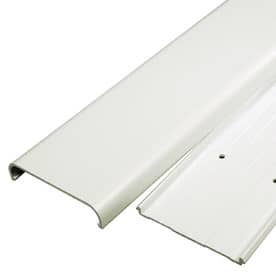
Anytime you’re routing and managing cables be sure to allow for some extra slack and flex.
Also, document and go slow. Nothing sucks more than bundling a whole bunch of cables and then realizing you left one out, or months later having no idea what a particular cable attaches to.
Putting Your Design Together
Maybe it’s too many years in postproduction, but I’m really into the idea of previsualization these days.
When it comes to suite design, sure, an AutoCAD program would be cool but that’s probably overkill.
A couple years ago when my wife and I were redesigning part of our house, I discovered AutoDesk HomeStyler.
There are lots of competing apps out there (Google Sketchup comes to mind), but I love this tool because there are device apps and you can run it through the web, and it lets you visualize in 2D and 3D.
Even better?
HomeStyler links with several major online retailers so if you want to place a couch in a room you don’t have to approximate its dimensions – you have the actual couch dimensions ready to go from the manufacturer!
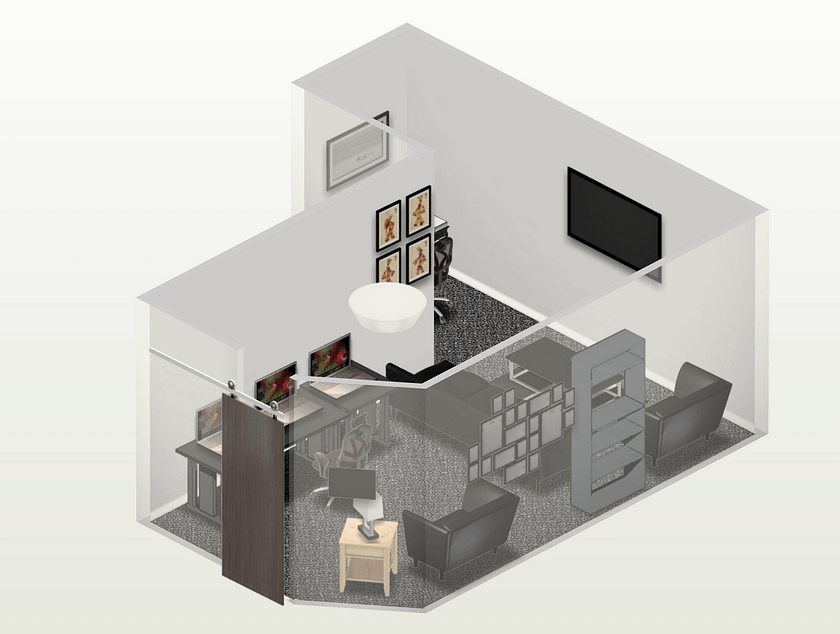
In the next installment of this series, I’ll talk more about room layout in regards to furniture and positioning but overall, I’ve found HomseStyler extremely easy to use and a great tool for laying the ground work on suite design.
Next Steps
In the next installment of this series, we’ll dive into more technical matters including reference, and client monitor selection, in-suite and machine room routing, audio setup for a color room and even a little bit about computer considerations. For sure, there is a lot more to cover about suite design.
Questions, comments? Please use discuss below
– Robbie

