| Series |
|---|
Color Board Foundations: Part 1
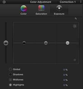
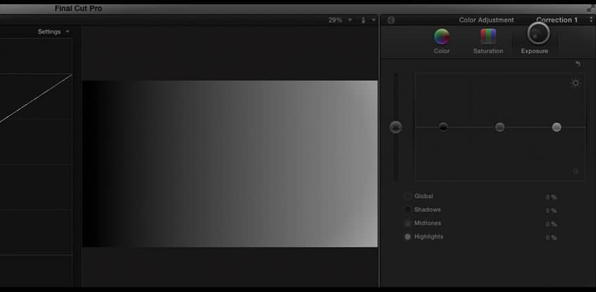
When Apple rolled out FCP X, they re-visualized its color correction interface—splitting FCP Studio’s 3-Way Color Corrector into three panels: Color, Saturation and Exposure (which I prefer to think of as Contrast).Within each of these three panels we manipulate individual ‘pucks’ that control the image in four tonal ranges: Master, Shadows, Midtones, Highlights.

But how much influence does each puck have over the image?
The answer to this question will guide us to developing a fast, efficient workflow when grading.
In this article, we’ll explore FCPx’s Exposure tool – which may give us an idea as to which controls we want to grab first when initially setting the contrast in a shot. In later articles we’ll take a look at the Color and Saturation pucks – finally coming up with a ‘best practice’ to help us become as efficient as possible when color correcting within FCPx.
Note: The exploration of these controls that I present in this series of articles is one I do whenever evaluating a new color grading tool – be it a plug-in, filter or stand-alone app. I encourage you to try it out whenever you need to figure out a color correction tool.
– pat
Member Content
Sorry... the rest of this content is for members only. You'll need to login or Join Now to continue (we hope you do!).
Need more information about our memberships? Click to learn more.
Membership optionsMember Login


