| Series |
|---|
Team Mixing Light Note: We are pleased to welcome Jason Bowdach to our roster of Contributors, here on MixingLight.com. He kicks us off with a great article & video on an important subject. Please join us in welcoming him to Mixing Light, in the Comments below! You can find out more about Jason (and all of our Contributors, on the About Us page)
How do you know if your favorite LUT is destroying your images?
“A little knowledge is a dangerous thing” – Alexander Pope
Over the last few years, LUTs (or Look-Up Tables) went from being an esoteric technical tool, understood by only the most technically inclined, to a common tool that most Directors, DPs, and Producers are now somewhat familiar with. I emphasize somewhat because the potential usage of a LUT has been stretched far beyond its original purpose, making creative discussions with clients difficult without clarification about WHY we are using a look-up table in a specific workflow.
As LUTs can perform a wide range of color manipulations, they’re used for a huge variety of both technical and creative purposes. In one workflow, a LUT may be used to technically transform the source image from the camera’s capture format (typically stored RAW or logarithmically) into a more visually pleasing Rec709 image. In another workflow, a LUT may be used to apply a creative look to footage that has already been normalized and balanced. In a third workflow, a LUT might combine a technical transform with some creative adjustments, making a hybrid LUT that is both technical and creative. The possibilities are so vast, that it’s potentially destructive. Therefore, a golden rule to remember is that all LUTs are not created equal. This situation is exacerbated by the fact that LUTs are essentially “black boxes,” which obfuscate our ability to see whats going on “under the hood” of a LUT.
How well do you understand your LUT?
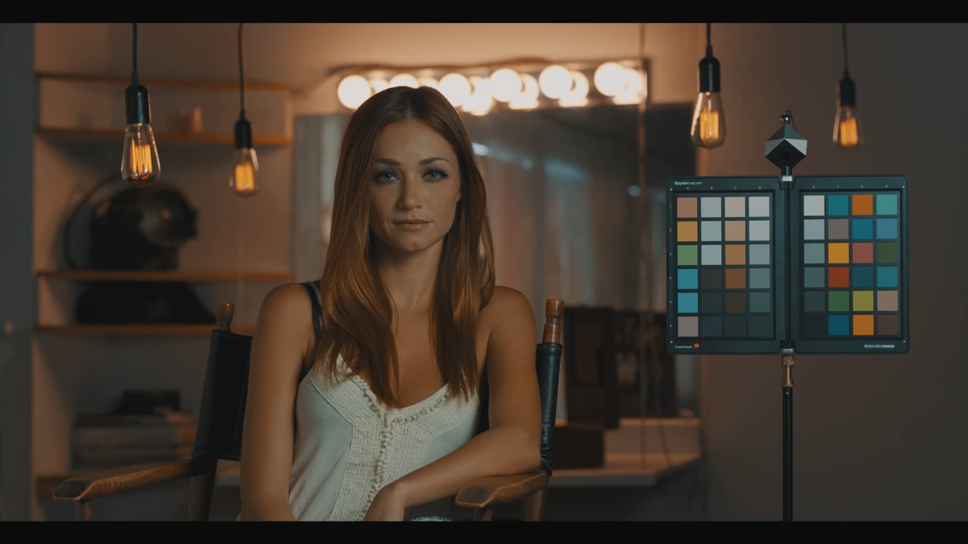
As I’m sure many of you can attest, it has become common practice to provide the colorist \ finishing artist with the LUT used in-camera (while shooting) or for dailies color prior to beginning final color & finishing. The LUT provided may be a generic transform LUT supplied by the camera manufacturer (great!), a custom LUT developed specifically for the production (even better!), or a random LUT that someone from the production found online in a forum (not so great). Unfortunately, from a colorist perspective, it can be difficult to objectively judge the quality of the LUTs being provided, even when applied to a variety of real footage.
Could using the provided LUT during final color result in artifacts, banding, or noise that might not be present in the source?
Potentially. Aside from applying the LUT to a huge library of test footage, is there a way we can evaluate the LUT more objectively? Yes, there is.
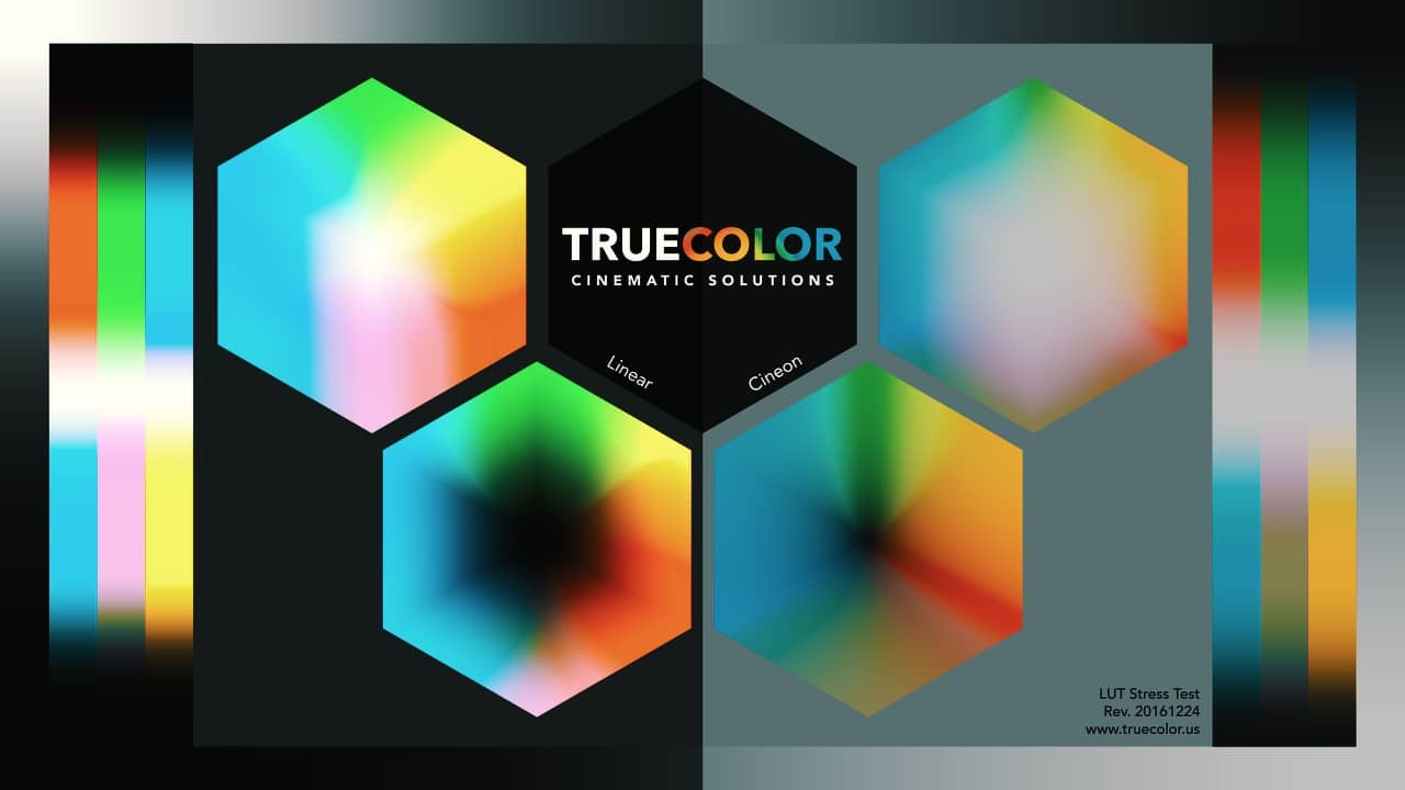
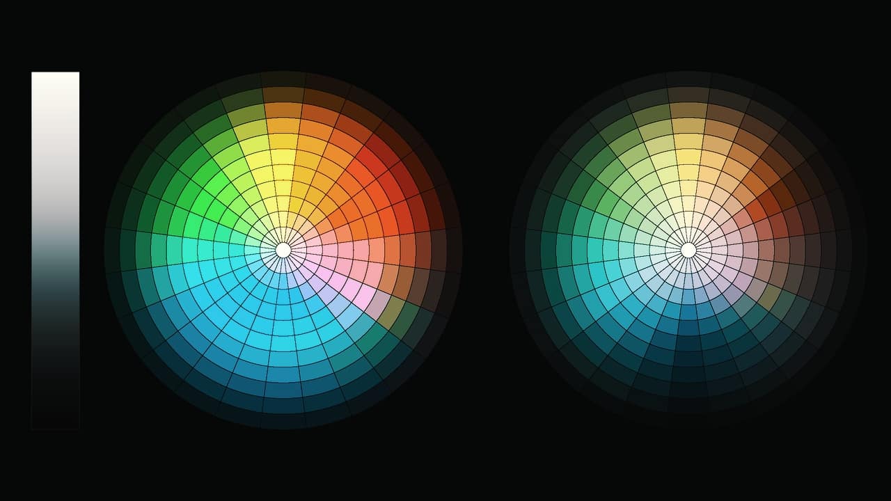
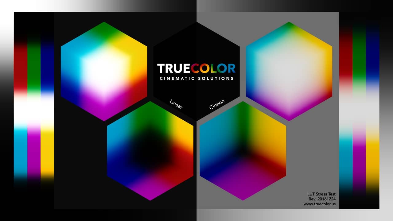
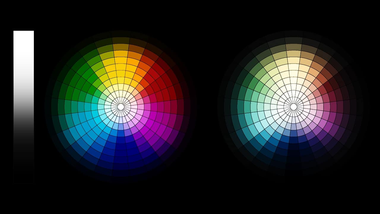
Test charts & objectively stressing your LUTs
In previous Insights, Patrick demonstrated how we can use a greyscale ramp to visualize the effects of a LUT. While evaluating on a greyscale ramp is certainly helpful, we can get even more granular. In my research on the subject, I found several unique test charts that when combined on a single timeline, make for a powerful “LUT Stress Test” and a great addition to any colorist’s toolkit.
Stressing the LUT: The Baseline Images
Let’s take a look at the test charts & clips that I’m currently using in my stress test timeline (all the images in this Insight can be clicked, for a larger version):


Stressing the LUT: Arri LogC to Rec709
Note: The images I’m sharing in the remainder of this Insight do suffer some JPEG compression artifacts… but I think the degradations I’m talking are clearly visible and distinct from the compression artifacts.
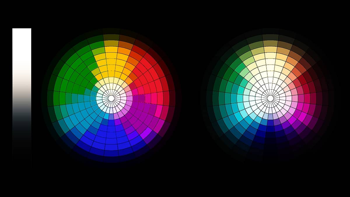
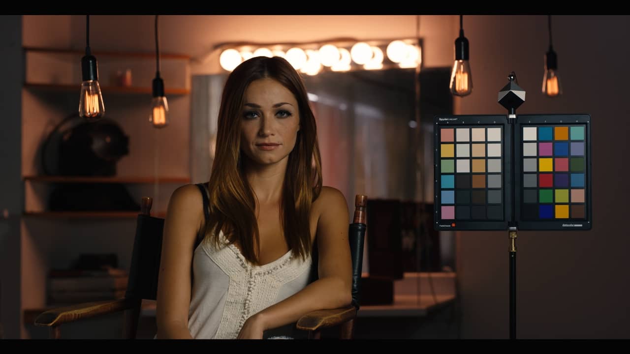
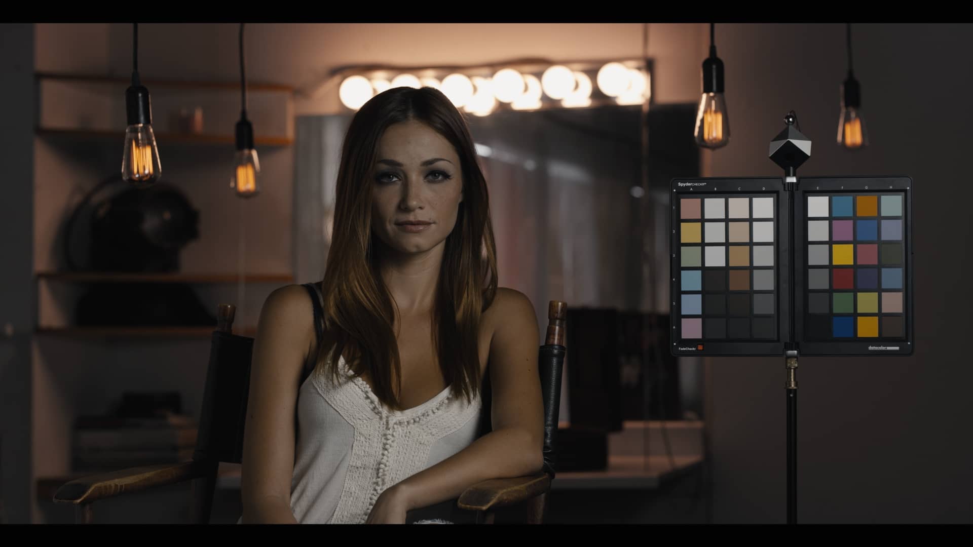
Before we take a look at anything too outlandish, let’s evaluate a common LUT that most of you are familiar with and happens to be bundled in all versions of DaVinci Resolve: Arri’s LogC to Rec709 Transform LUT.

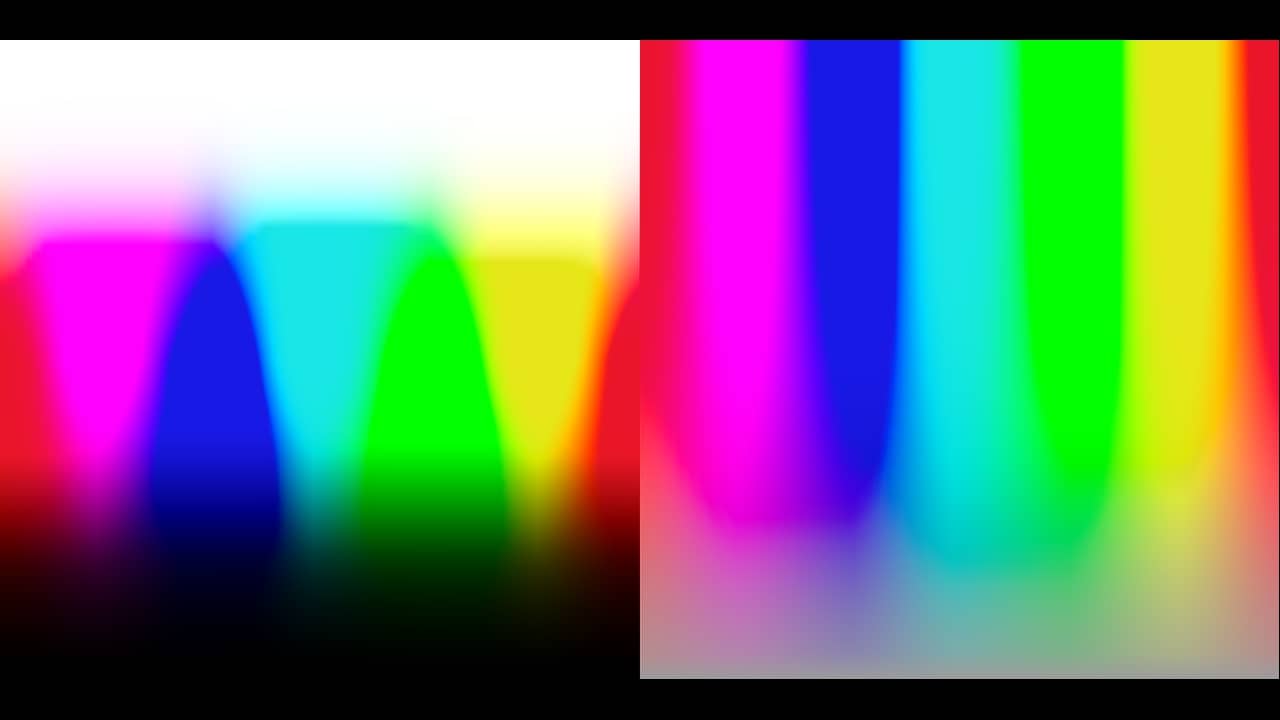
Reviewing all three charts, its easy to see what the LUT is doing and more importantly, if it causes any image degradation such as artifacts, noise, and banding. For example, Arri’s LUT appears to significantly increases the saturation and color contrast, causing a fairly clean “edge” line between colors that can be seen quite clearly on the 1st chart. While the more visually attune might be able to see the same in the real world test image, it is not as apparent and easy to see. It’s also more difficult to see any imperfections introduced by the LUT with the real-world image unless the image is pushed so far that it “breaks”. In this case, I see nothing of concern in either the real-world test image or the charts, but given this is a proven look-up table by the camera manufacturer, I would be concerned if I did see any signs of image degradation.
Now that we have a reference, let’s evaluate a few different LUTs using out Stress Test Timeline and see how they fare.
Stressing the LUT: Kodak film emulation
First up, I’m going to test a popular 3rd-party Kodak film emulation LUT, which has been backed by some pretty well-known talent:


While the test image looks pretty good with the Kodak film emulation LUT applied, it becomes clear there are some problems when we look at the charts. The LUT appears to create artifacts on the test charts, especially with magenta hues. Diving deeper (as seen in the video Insight below), adding a serial node and raising the gamma allows you to see any degradation more clearly, especially if it exists in the shadows. Adding a splitter-combiner node allows you to inspect the individual Red, Green and Blue channels to see a LUTs effect on each individual channel, if you want to go to that extreme level.
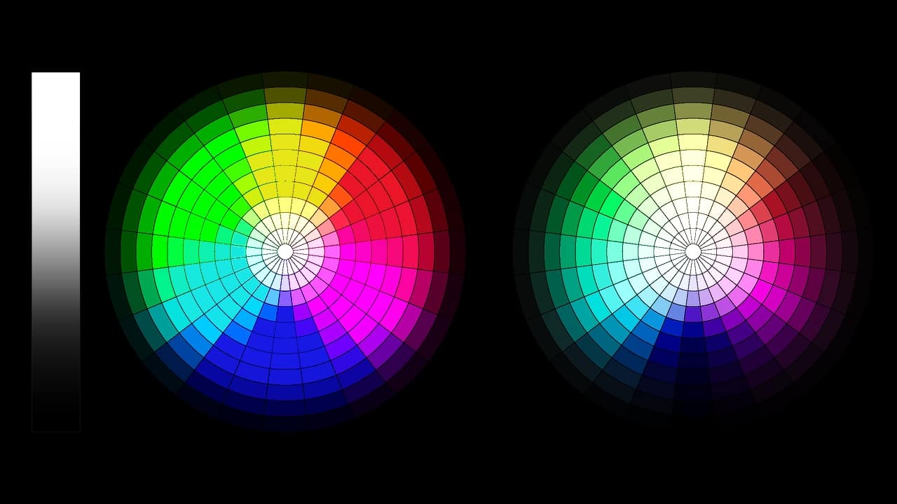
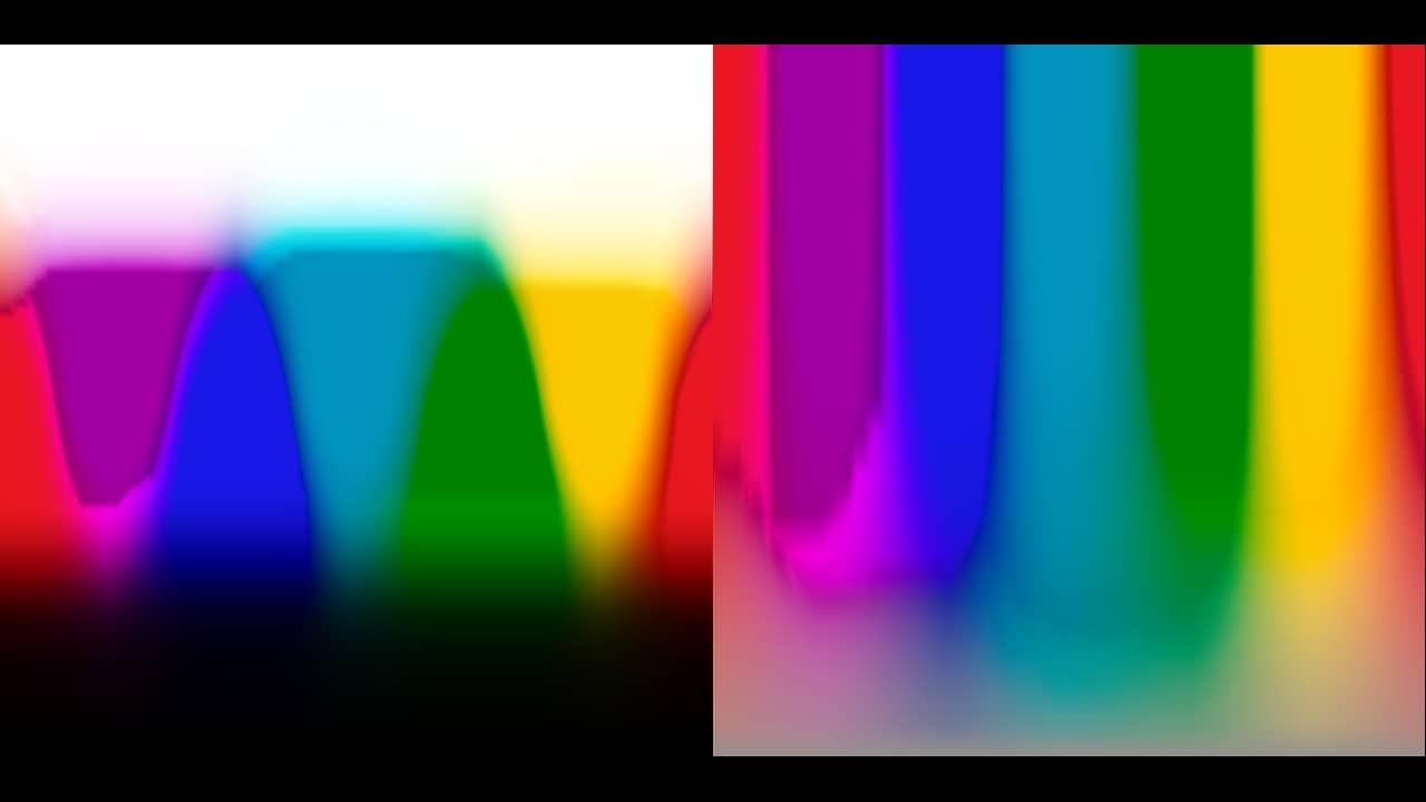
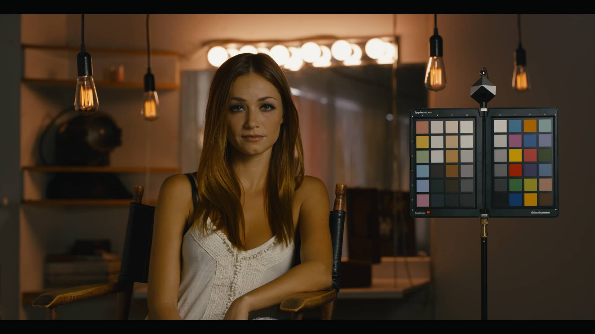
Stressing the LUT: Kodachrome Look Lut
Evaluating this Kodachrome-inspired LUT using our stress test, we see nothing obviously wrong with the real-world test image but the charts show a different story:


Strange artifacts appear as we approach the highlights and some checkerboard-like patterns appearing in the blue-cyan color gradients have me very concerned. I wouldn’t be surprised to see increased noise and artifacts in blue skies using this LUT, based on what we’re seeing on the above charts.
Now, this isn’t saying you should avoid this specific look-up table but the stress test provides us with more information that allows us to make an informed decision about using it and what to expect. It also provides something more visual to use with clients in the discussion about using a specific LUT or if you should re-create a look from scratch in Resolve.
Stressing the LUT: Teal & Orange Look
Let’s evaluate a 3rd-party teal & orange creative look LUT I found on a forum:

Looking at the test image, there is no obvious reduction in quality or artifacts. However, evaluating the test charts I see unnatural looking artifacts visible in the blue and green hues. Nothing too major but certainly something to keep in mind if accuracy in those hues ranges is of concern for the specific project you’re evaluating this LUT for. That being said, the look is a teal & orange variant so its not surprising to see those colors being manipulated.
Stressing the LUT: Generic Film Emulation
Let’s evaluate one more look-up table, a freely-available film emulation LUT from the wonderful folks at Light Illusion:

Compared to many of the other LUTs we’ve evaluated, the film emulation LUT available from Light Illusion is far less destructive to the image. I see no visible artifacts, noise or banding in any of the four images or charts (aside from what negligible amount would be considered part of the film emulation look and curve). While the results of this stress test are up to a certain amount of interpretation, this specific look-up table passes with flying colors as far as I’m concerned.
Additional Thoughts
If you’re interested in learning more about what a LUT is doing “under the hood”, you can use the concepts demonstrated above to visualize the changes using the same charts we use as the stress test. These charts clearly indicate the changes in hue, saturation, and contrast you can expect from a LUT.
If you’re a Resolve user and want to sharpen your skills then grab a still of a chart with a LUT applied and match it by hand – when you have some time between sessions.
I hope this insight has given you some ideas you can use and develop your own stress test. Please share your feedback, as I’d love to hear your thoughts.
Special Thanks
Thanks to the lovely folks at True Color & 3D LUT Creator for creating the test charts used in this insight. All the charts used in the article and video are available to download for free on their websites. Click the links for the download pages and further information.
The real world test footage used in this insight is available from RED’s website. I converted it to LogC using Resolve Color Management as I felt it was more standardized and therefore, a better test for look-up tables.
And the LUT from Light Illusion is freely available at their website.
-jason
