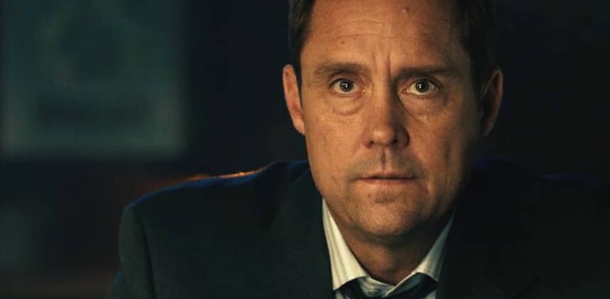
Colorist Inspiration

Colorist Inspiration – February 2016

February 2, 2016

Dan rounds up the best colorist inspiration from February 2016 with some of the best grades from the new year so far. 


Series

Colorist Inspiration – February 2016

Time for another Colorist Inspiration!

There has been so much great work recently that I thought it was the perfect time to get your creative juices flowing and fired up for 2016.

I also have a little news from my personal world also.

I have left Smoke and Mirrors and joined a great boutique post house with some of my best friends and started my own grading department.

It was a big decision but I’m thrilled to be in the driving seat and ready to take on some amazing projects!

Hopefully this will help me with even better insights as I’ve gone from a world of having two assistants and other colorists around me to being on my own.

I also just built a machine with 8 Titan X cards in it and a Sony 4k HDR monitor so I’ll make sure to document my adventures into this new world.

For now back to some amazing work from the world of colour grading!

Member Content

Sorry... the rest of this content is for members only. You'll need to login or Join Now to continue (we hope you do!).

Need more information about our memberships? Click to learn more.

Membership options
Member Login

Are you using our app? For the best experience, please login using the app's launch screen


Comments

Homepage Forums Colorist Inspiration – February 2016

  • Congrats on the move, best of luck on the new adventure! Some great inspirations to start the year. Many thanks, Dan!
    Its funny how things that used to be consider imperfections in the image (flares, dust, grain, etc) are now “personality”. It seems, “New is old, and old is new”


  • Taylre Jones
    Member

    Here is my rating in order of visually pleasing to me.

    River (Interiors)
    The Gambler
    Genghis Kahn
    Out Of The Woods
    Massive Attack

    I felt like River was a bit too stylized in the exterior blues/teals. Not to say this was a bad decision it just felt like too much to me. I LOVED the interiors with the teal/blue accents out the windows. The skin is beautiful.

    The Gambler was great through and through.

    Really enjoyed the vibe of Genghis Kahn. There was a little bit of over sharpening for my taste. It did add to the vibe but I felt like it was a touch too far. Color palette is great on this!

    I love Dave’s work. Of his music video work this isn’t my favorite. No doubt that there were a lot of fun factors to work through in it though.

    I have nothing against Massive Attack. I know the nightmare of night time shooting. I just wasn’t drawn to the piece.

    These are all personal preferences of course. In two months the ones I liked most could totally change. 🙂


  • Jacob Dyer
    Guest

    I loved the look of Genghis Khan, the production design really had the old-school Bond feel. The Gambler was good too.

    Congrats on the new gig Dan, love to see your machine setup with 8x Titans!

  • My favorite was River because the texture of the grade with the cinematography combined to create a very powerful story. Taylor Swift looked beautiful, but that is all, beautiful and shallow like a fashion shoot.


  • Scott Stacy
    Member

    I’m going with the Gambler. The pools of light are very well thought out; probably, making it a pleasure to grade. Not to mention brilliant composition and thoughtful editing. Would love to see a couple stills of the set to see how the gaffer flagged everything.

  • It’s funny my experience with teal and orange is the same. I love how River looks, but i would not be allowed to do that on any video that would have a suitable cinematography. Somehow most of the people i work with think this is too heavy or too cliche. I think it looks great when used right!

Log in to reply.

1,000+ Tutorials to Explore

Get full access to our entire library of over 1,100+ color tutorials for an entire week!


Start Your Test Drive!
Loading...