Adding Colour Contrast To Night Footage (in DaVinci Resolve)

February 14, 2023

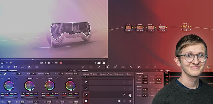
Colorist Luke Ross demos a creative technique he used recently, adding colour contrast to make a night image pop using foreground separation.


Back to basics: A simple technique for adding colour interest to night images

Sometimes it’s hard to make an image look cinematic when you are working with a limited palette of neutral tones or heavy colour casts. I was recently grading a documentary and I found two big limiting factors to my creativity:

  • The footage was (naturally) very dark
  • The footage had heavy colour casts throughout due to street lighting that tended to ‘flatten’ the colour palette.

The visual compositions of the shots were my saving grace. They allowed me to isolate and separate the foreground from the background using a consistent, straightforward approach using broad Power Windows.

This creative grading Insight explores adding colour contrast to make a night image pop, using foreground separation. This example uses two Sony clips shot at night for a motorbike documentary.

The technique used here can be used on any camera/footage where you have a monochromatic colour cast but want to add visual interest. It also has the benefit of being quick to execute, especially if you have hundreds of shots to get through with a limited amount of time/budget.

Key takeaways from this Insight

By the end of this Insight you should understand how to:

  • Identify areas where colour separation could improve the image
  • Make colour contrast decisions based on the content of the image
  • Create negative shape mattes
  • Adjust opacity of shape mattes to dial in your corrections

Related Insights

Questions or Comments? Leave a comment!

Is this Insight useful to you? Let us know! Mixing Light is all about community discussions and we’re curious if you found this helpful, if you have something to add, or if you have more questions you need answered?

– Luke

Member Content

Sorry... the rest of this content is for members only. You'll need to login or Join Now to continue (we hope you do!).

Need more information about our memberships? Click to learn more.

Membership options
Member Login

Are you using our app? For the best experience, please login using the app's launch screen


Comments

Homepage Forums Adding Colour Contrast To Night Footage (in DaVinci Resolve)


  • Jim Robinson
    Member

    Not being critical, but I think your overall fix looks good, but can’t help but think that you may have created a lot of the problems of it looking flat and not popping with the contrast node. Contrast pivot that low is essentially moving the middle grey up in exposure and not actually gaining much contrast. It’s essentially just pushing up the gamma. I think if the exposures middle grey was locked off ( around .420 for ACEs cct ), that the toe and highlight roll off would’ve made it look less flat right off the bat and the roll-off on the highlights might have made the source light less of a problem.

    The first image looked like it did need some saturation in the image , because although it was night, it was fairly bright in the tunnel – It might also be of note to new colorists that the tint or the cast might be intentional as well. Some older cities still have vapor lighting and the DP could want that to show – especially if the scene is set in a different decade.
    These are just suggestions however – if we all attacked scenes and grading the same way – everything would be boring and it would all look the same.
    Easy to follow though, I like your teaching methods and approach. Looking forward to more from you – Thanks.


    • Luke Ross
      Member

      Hey Jim

      Thanks for the comment! I often use the contrast/pivot controls to adjust exposure/ratio – I find it quite a natural tool to target certain areas of the image. I’ve found that if I push it too hard, it really starts squishing the highlights/shadows in an unnatural way, but in moderation it can be helpful.

      It’s funny that you mention the intentionality of the colour cast, this is definitely a discussion that the DOP and I had for this project! Initially I “over-balanced” the street lighting and the DOP asked me to meet him in the middle – we ended with a good mixture of balance and the original cast.

      Cheers Jim!

  • Cool look, I don’t think it would have occurred to me to adjust the road like that, it looks very nice. Any particular reason why you use the Resolve CST to transform into ACES rather than the ACES transform tool?


    • Luke Ross
      Member

      Thanks for the comment – I haven’t actually used the ACES transform tool as I’ve always used Resolve CSTs! I have been comparing a DaVinci Wide Gamut/Intermediate workflow compared to ACES recently – it’s great to hear more ways of getting into those spaces. Have you had experience using the ACES transform tool? What are the pros/cons? I’ll take a look, thanks for the heads up 🙂

      Cheers Jamie!

  • Hey Luke, I like the look and your approach to grading.

    One noob-y question: why is your timeline color space set to rec709 gamma 2.4? Won’t that make your tools work in rec709 rather than ACES?


    • Luke Ross
      Member

      Thanks for the comment! Not a noob-y question at all – it’s my understanding that any nodes between CSTs operate independently from any project wide colour management. My working nodes were operating within the ACES transforms, therefore the grading tools respond as per the ACES environment.

      If I were to place any nodes outside the CSTs, they would operate in the Rec709 / Gamma 2.4 environment.

      Cheers Greyson!

      • Hi Luke,

        We met very briefly once over drinks with Katie in pre-covid times. Nice to hear a kiwi accent pop up on Mixing Light!

        >> My working nodes were operating within the ACES transforms, therefore the grading tools respond as per the ACES environment.

        >> If I were to place any nodes outside the CSTs, they would operate in the Rec709 / Gamma 2.4 environment.

        Sorry, but this is demonstrably untrue.

        In both colour-managed and non colour-managed projects, colour space aware tools behave according to the timeline colour space and gamma set in project settings unless you proactively change the setting on a per-node level (right click->colour space/right click->gamma) or with the HDR tool in the 3 dot menu.

        CSTs transform the image essence, but absolutely do not pass on colour space metadata to the following nodes in order to make colour space aware tools on nodes after that CST behave according to the output settings of that CST.

        You can prove this very easily by grabbing a ramp and creating a 3 node sandwich going from 709/2.4->DWG/I (or ACEScct or any intermediate space), +3 stops using HDR global exposure in the middle node, and then DWG/I->709/2.4. Take a still with the timeline colour space and gamma in project settings set to 709/2.4, and another with the timeline colour space and gamma in project settings set to DWG/I (or whatever intermediate space you used).

        If what you said above was true, the images would be identical, because both would be +3 stops in a DWG/I environment. But the images are in fact drastically different because the middle node is being processed in a 709/2.4 environment if that is what your timeline colour space and gamma is set to in project settings.

        I accept that in your video you don’t appear to be using any colour space aware tools, so it wouldn’t have an effect on this particular shot in the video, however, regardless, it is IMHO a terrible colour management practice to have your timeline colour space and gamma in project settings set to your output space rather than your working space — that’s the entire point of the setting?


        • Luke Ross
          Member

          Hey Alastair

          Yes indeed – very nice to see a familiar Kiwi name! I hope you’re well!

          Noted, this is great to confirm. I normally set my intermediate space (DWG/ACES) as my timeline colour space but in this case I failed to do so. Clearly I didn’t fully interpret the node colour space journey consequences! I’m still getting used to Resolve Colour Management after swapping from Baselight, so your comprehensive comment was immensely helpful 🙂 Greyson, I stand corrected!

          If you’re ever down in Wellington Alastair give me a buzz!

  • I’ve not experimented enough with the ACES Transform tool but I *think* it’s more contrasty, does it include a LMT to alter the look slightly?

    Regarding the other question of colour space aware tools, I don’t think Resolve is clever enough to work how you suggest? It needs to be told how the tool is set up. Maybe Darren’s video covers this https://youtube.com/watch?v=BZqe9jXgPLg&feature=shares

Log in to reply.

1,000+ Tutorials to Explore

Get full access to our entire library of over 1,100+ color tutorials for an entire week!


Start Your Test Drive!
Loading...