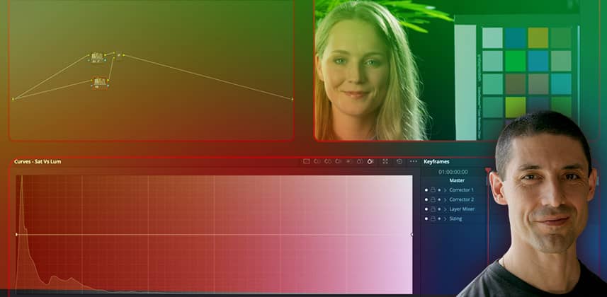
Tips on using Hue-vs-Sat Curves (without damaging your images)
Long before the Sat vs. Lum tool was added to Resolve’s menu of HSL “X vs. Y” curves, I was submitting feature requests for this tool. Adjusting the luminance of pixels based on how saturated they are is an extremely useful ability to have.
It’s exciting to have this functionality at our disposal. But to make good use of it, we need a clear understanding of what exactly it’s doing. Just as important is knowing how you can create image artifacts by misusing them.
In this Insight, you’ll learn best practices for using the Hue-vs-Sat curve effectively while avoiding nasty artifacts!
Learning goals for this Insight
By the end of this video Insight, you should be able to:
- Quickly decode which parameters of our image a particular “X vs. Y” curve is altering (and which it isn’t!)
- The amplitude of a saturation channel in log space and how this relates to the use of our curves
- Craft a gentle but intentional curve for the best results
- Combining the Sat vs. Lum curve with an HSL qualifier to prohibit or limit its effect on skin tones
Related Mixing Light Insights
- Flight Path: The DaVinci Resolve Color Page Toolkit – Curated list of color grading tutorials to get you up to speed with the main features of DaVinci Resolve’s Color Page.
- Building Custom ‘Lum vs Sat’ Curves In HSL Using Resolve’s Node Graph – In Part 5 of Cullen’s ‘Visual Math’ series, learn how ‘vs. Curves’ work from within Resolve’s node graph by building your own in HSL space.
- Build Your Own Qualifier In HSL Color Space Using Curves – Learn an alternate method for creating masks limiting adjustments to particular luminance regions, using Curves and Splitter/Combiner nodes.
- From the Mailbag: HDR Musing & Saturation Levels For Log-Encoded Footage – Team Mixing Light discusses HDR and best practices for setting saturation levels for log-encoded footage
– Cullen
Member Content
Sorry... the rest of this content is for members only. You'll need to login or Join Now to continue (we hope you do!).
Need more information about our memberships? Click to learn more.
Membership optionsMember Login


