| Series |
|---|
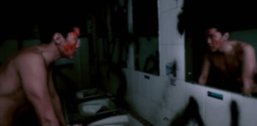
An Inside Look at Creating the Korean Horror Look
I thought it would be great fun to take a grade from a real session I did with a DOP and Director and share it with you guys. The source is 7d material that was shot with quite a nasty orange cast that made the image seem very flat and the blood and atmosphere was lost. I went for quite a grungy green-tinted grade that embraced the noise instead of hiding it.
In the video, I will step you through all my nodes and you get to see how messy my nodes get when there are clients involved! In this video, I focused more on the break down than sharing which buttons I pushed so if you do have questions or feedback please do post them in the comments and I’ll be able to help you out!
– Dan
Member Content
Sorry... the rest of this content is for members only. You'll need to login or Join Now to continue (we hope you do!).
Need more information about our memberships? Click to learn more.
Membership optionsMember Login


