Warm Looks: Yellow Warmth Vs Red Warmth (which are you?)

November 12, 2016

Warm looks don't always have to be rosy red and cozy looking. Take a look at a non-traditional warm color and learn how to add it to your color toolkit.


Series

Looks can sometimes be very simply broken down into large categories and one of the most basic is warm looks vs cool looks? Of course, we ask that in a much more complex way so our clients know that we have spent countless painless hours researching these amazing looks.

I was watching the latest John Lewis Christmas ad in the UK, which is our equivalent of the super bowl for advertising, and loved the yellow warm look.

It made me realise that I almost NEVER go for a yellow warmth.

I thought investigating this would make a fun insight!

Some Examples

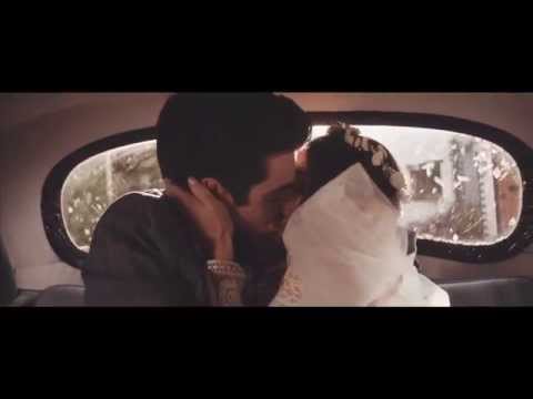
Before we jump into my video insight below have a watch of my favourite examples of yellow warmth and then an example of my traditional style of warmth.

First up is the John Lewis Christmas ad for 2016 expertly graded by Jean-Clement at MPC.

John Lewis Christmas #Buster the Boxer from Factory Studios on Vimeo.

In contrast to that, you have a video I graded a couple of years ago that I would say is my traditional warmth. If you skip ahead to 2:05 you’ll see exactly what I mean!

Is It Just Me?

So is it just me that tends to drift towards red and orange when grading warm instead of yellow?

I’d love to know your opinion on this so please drop me a comment below!

Enjoy!

-Dan

Member Content

Sorry... the rest of this content is for members only. You'll need to login or Join Now to continue (we hope you do!).

Need more information about our memberships? Click to learn more.

Membership options
Member Login

Are you using our app? For the best experience, please login using the app's launch screen


Comments

Homepage Forums Warm Looks: Yellow Warmth Vs Red Warmth (which are you?)


  • R.NeilHaugen
    Guest

    Key comment was quite early … the difficulty of going warm yellow without pushing greens into uncomfortable places. Amber’s just easier, isn’t it? But one shouldn’t put all one’s eggs in one small bucket. Very useful vid.

  • Using the 3 and . Printer light keys make it easy to get pure yellow.


  • Dan Moran
    Member

    Thanks Sir!

    I felt a bit guilty that I discount yellow warms without thinking about them in grades and thought it would be a fun share!

    D


  • Dan Moran
    Member

    Very good point! The Resolve panel that I use only actually has Master / Red / Green / Blue so I’m used to doing it that way

  • Great video. When I client asks me to go warm, I actually tend to err yellow as opposed to orange/red. There’s something about that Soderbergh “straw” color (especially as seen in Magic Mike) that I really dig. But it is tough…always skating on thin ice being so close to green. And the client doesn’t usually go for it…just the other day I got something bounced back with a comment that it was “overall too yellow.” It can be tough when skin tones get involved, particularly in the commercial world.

  • You make some great points!! I notice I seem to lean towards amber / orange gold warmth as opposed to yellow. It does get overbearing quickly (especially with skin) but that example was very classy & sophisticated looking. Got some new ideas to experiment with. Thanks Dan!!

    Do you ever have any issues with yellow tones making the grass / foliage look less vibrant ??


  • Andy DV
    Member

    Great insight! I find using the blue/red curves offer a little finer “push/pull” control, to use your term. I can throw that desired yellow in the highlights / higher midtones by lowering the blue curve, but keep the skin and shadowier bits where I want them with the red curve. Tint/Temperature controls are surprisingly good too – the terms are misleading IMO since an overall “tint” or wash is the last thing I want…but the tint/temp sliders offer some pretty subtle pushes if used sparingly.


  • Andy DV
    Member

    Yeah. I find my grass/foliage can suffer at the expense of warm looks and especially skintone adjustments, since I’m always trying to suck the green out of those areas. Likewise anytime there’s a film LUT involved…grass tends to go yellow. I usually resort to secondary/highlight adjustment for that.

  • Dan, what a lovely music video! Such great example when story, edit, grade and music complement each other and work well together.
    I love it, great work!

  • I’m gonna throw a controversial point into the discussion. Particularly looking at the John Lewis ad, I notice that the yellow light on Buster (the boxer) is coming from the outside street lamps that light up the garden scene. Of course these days UK street lamps are either sodium-orange or resemble that greenish light coming off domestic energy-saving light bulbs. No, I’m not a fan of those bulbs, who is? But I wonder if Soret (and van Gelder) made the decision to use this to create a more realistic feel to the story – move away from the usual cheesy candle-light x-mas cozyness? Also maybe, subconsciously, we are all getting more
    used to this yellowy-greenish light in comparison to old school tungsten – if we like it or not!?


  • Paul Wolf
    Member

    so good

Log in to reply.

1,000+ Tutorials to Explore

Get full access to our entire library of over 1,100+ color tutorials for an entire week!


Start Your Test Drive!
Loading...