| Series |
|---|
Monitor Calibration Part 1 – Overview & Gear
Nearly every day, Team Mixing Light fields questions related to technique, aesthetics, gear and even color theory.
Over the past few months, a pattern has been developing in the questions we get – people are really interested in monitor calibration!
These questions range from broad to very specific calibration questions:
What’s the best way to calibrate my monitor?
Should I be using a color matching function like Judd-Vos with my new OLED monitor?
While we answer many of these questions privately or add them as future ideas to MailBag episodes, I think its important to start talking about calibration, and to do so more collectively as colorists and those who are interested in color.
It seems like over the past few years where color grading was once mysterious, expensive and very complex, calibration is now that way for a lot people – you might get it in principle but the how and why of calibration is still very unclear.
I’ll admit, on its surface Calibration is complex! There’s math, there’s gear and there’s learning new software not mention the time and cost involved in getting a capable calibration setup.
For these and other reasons, many people simply don’t bother with monitor calibration. Indeed, if you ask many people if their monitor is calibrated they’ll say “Sure! They do that at factory”. While that might be true – how accurate is your monitor 2, 3 or even 5 years later?
The past few years have brought amazing advancements in the gear, software, and workflow of calibration. In my opinion, the barriers to doing your own monitor calibrations are less and less.
That’s why I want you to make 2014 the year you strive to understand calibration and even possibly start calibrating your own monitors.
This Insights article is the first in a series of articles and videos I’ll be doing about monitor calibration. I’ll start out in this article with a 50,000 foot view of calibration – specifically discussing why calibration so is important as well as the major gear components like meters, pattern generators and calibration software.
In later Insights we’ll dig into specific and increasingly more advanced topics.
Let’s jump in!
****Important note. While similar in its approach, throughout this article and in future articles and videos on calibration when I say monitor, I’m not referring to a computer monitor but a dedicated video or reference monitor commonly used for color correction.
Why Calibrate?
At its core, calibration is all about trust.
- You need have trust in your monitor that the color grading decisions you’re making in software are accurately displayed.
- Your clients need to trust what they’re looking at is the truest representation of their footage, which in turn helps them trust you.
Trust in a monitor is built through accurate calibration; and accuracy of calibration is based on your monitor adhering to known standards – Like REC 709, DCI-P3, BT1886 etc.
You can think of calibration as simply adjusting the performance of display to meet or get as close as possible to a standard.
You’ve no doubt heard the phrase a “reference monitor” before. Well, what makes a monitor a reference?
Its accuracy through calibration.
When looking at a properly calibrated reference monitor white is white, red is red and so on.
But more to the point, grayscale points and color matches (or is extremely close) to a specified standard like REC 709 where the actual values of a particular color or shade of gray are defined.
How are values defined?
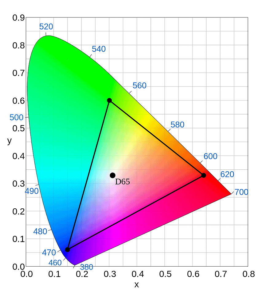
Without getting overly geeky, the most common way you’ll see the standards mapped is on a CIE 1931 Chromaticity Diagram.
The 1931 XYZ color space shown on these charts is based on significant research and resulted in what is referred to as the 2° Standard Observer. A CIE 1931 chromaticity diagram shows the total range of colors that most humans are able to see.
On a 1931 diagram any given gamut can be mapped and xy values defined.


For example, you might have heard of D65?
On a 1931 diagram, those values would be x=0.31271, y=0.32902
With a standard like REC 709, every color within that gamut has coordinate values, so when calibrating if the values of your monitor for a particular color or grayscale value don’t match the standard (that variance is called deltaE or ∆E) you know your monitor is not properly calibrated – and again the goal of calibration is to get your monitor to align to the standard values.
We’ll talk more about ∆E its importance, and the different ways that software calculates it in later Insights.
This begs the question – is it possible to be perfect?
No, there is no such thing as perfection.
When it comes to diagrams like a CIE 1931 Chromaticity Diagram it’s important to remember that “perfect” is mathematically derived.
So getting close enough (very low deltaE values) is a great goal, but you can’t expect perfection. Furthermore, at a certain point ∆E values cannot even be perceived.
Member Content
Sorry... the rest of this content is for members only. You'll need to login or Join Now to continue (we hope you do!).
Need more information about our memberships? Click to learn more.
Membership optionsMember Login


