Breaking a Habit
If you’re anything like me, you tend to color grade using tools and techniques that became a habitual part of your workflow. In my case, I’m a frequent user of both the primary Saturation control as well as the Color Boost for adjusting saturation while Contrast \ Pivot is my go-to for tweaking contrast. Aside from the muscle memory gained from repeatedly utilizing these controls (especially on a control panel), these personal preferences for certain tools allowed me to grade quicker and more efficiently as I rarely had to consider, “which tool should I use?”.
Standardizing your workflow on a core set of favorite tools seems like a great concept. It provides me the “best” tool in the shortest amount of time. Why wouldn’t the client be thrilled?
Jumping forward in my career a few years, I noticed a lot of my work looking similar.
In fact, too similar. I had two clients request highly saturated looks and due to my “habit” of reaching for the tool I’m most familiar with, I ended up with two VERY similar grades. While they weren’t “poor” looks by any means, I found myself disappointed as neither look was entirely unique nor did they take advantage of interesting opportunities presented by the source footage.
In an effort to increase my speed and efficiency, I inadvertently stifled my creativity. Long term, this threatens to reduced the value of my work. If I ever wanted to work on projects that take me outside my comfort zone, something had to change…
Going Back to Basics
I took a step backward and decided to change my mindset a bit:
- You need to treat each tool as its own instrument, regardless if they have similar end results.
- You need to focus on the subtle nuances that each tool provides instead of overarching broad strokes.
I discovered that the subtle nuances of some key controls can make all the difference. It’s the difference between an average grade and a superb one; a noisy shot and a clean one; a QC pass or QC fail.
The Saturation Evaluation
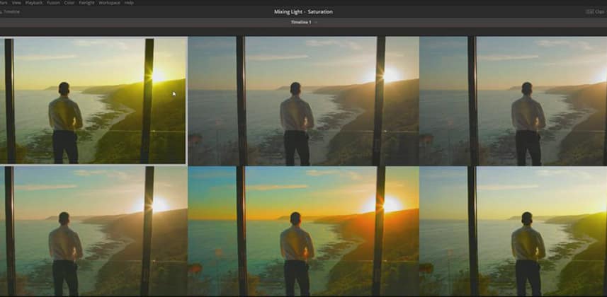
In this insight, I put the rubber to the road and walk through five different tools and techniques for adjusting saturation, with a focus on looking for those subtle (or sometimes not so subtle) differences. I also show a neat workaround for compressing a highly saturated image to fit within a specific gamut (i.e. Rec709) without a significant visible reduction in saturation.
In the process, we take a slight walk down the LAB color space path.
Member Content
Sorry... the rest of this content is for members only. You'll need to login or Join Now to continue (we hope you do!).
Need more information about our memberships? Click to learn more.
Membership optionsMember Login


