
Narrowing Your Color Palette
Have you ever noticed when you try and emulate a feature film look on footage shot in every day life its almost impossible. Even if you had an Alexa or a Red Epic which these films were shot on getting it to match up just doesn’t look the same.
This is down to two things. Firstly lighting place a huge part in the tone and look but have you ever noticed the color palette of the film has been carefully thought about and chosen?
Watch any feature film and you’ll notice most extras wear dull clothes and cars in the background are normally dull and muted. This has all been decided before the shoot which makes grading afterwards a lot easier!
Examples
Drive
Take a look at this trailer for the movie Drive. I’ve heard it used many times as a reference for a very well graded movie but this look is only possible to the great Art Direction.
Once you’ve watched the trailer please read my notes below!
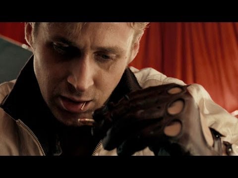
Did you notice the prominent color palette in drive is orange and teal? This is a palette we’ve seen many times before in films like Transformers and Battleship but I find Drive has the most tastefully done Teal and Orange I’ve seen.
Did you notice the lack of color in the cars and non lead characters? Every car or non lead character features low in saturation and is grey. This naturally helps our leads stand out.
Did you notice every time we see Red in the trailer its a dark blood red?
Combining this great art direction and a brilliant grade gives us this beautiful look
The Life Aquatic
A look at color palettes wouldn’t be complete without at least one Wes Anderson movie. Lets take a look at the life aquatic as a second example :
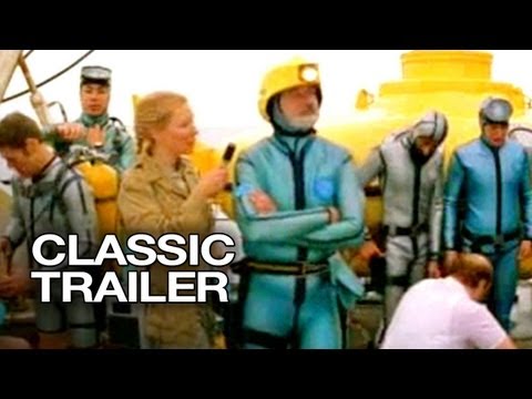
Take a look at how that cyan blue is prominent in every area. The ship, the internal decoration of the ship and of course their uniorms.
We then see a great orange to compliment the cyan in things like their hats, cups and accessories like the flippers when diving.
This look would be impossible without the art direction to establish this color palette that the colorist can then work on and refine.
What Can A Colorist Do?
Having well thought out and well executed art direction is brilliant if you’re lucky enough to get it but more often than not its up to us to implement the look on our projects.
If your trying to emulate a look from a film or commercial and its not working try looking at the hues and saturation in the scene and see if there is one particular color throwing off your look or perhaps there is way to many variations of a similar color like orange, red and pink?
Lets take a look at a before and after image where I have refined the color palette by reducing the amount of hues in the scene and matching the saturation levels. I feel this makes the look ten times stronger. All by changing hues and saturation of specific colors!
Doing what I’ve graded below on a big scale is almost impossible unless you have lots of time like on a commercial but I thought it would be educational for you to see the difference between two shots with the exact same look. One which I’ve used secondary corrections to control the color and tone of the image and one I haven’t.
Member Content
Sorry... the rest of this content is for members only. You'll need to login or Join Now to continue (your career will thank you!).
Need more information about our memberships? Click to learn more.
Get Answers, Join Now!Member Login

