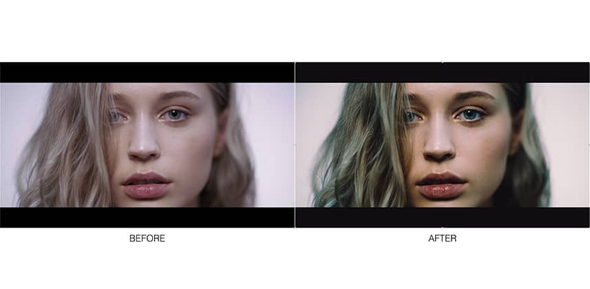
Adding A Touch Of Professionalism To Your Before and After Approval Stills
I’m doing more and more unattended grades these days. Because of this, I spend a lot of time sending before & after stills to various people.
People either don’t have the time or are just too far away to sit with me grading all day.
I’ve noticed when I quickly grab stills and throw them on a wetransfer link called something like “GRADE_WIP_2.1.3” it really doesn’t look that professional to the person on the receiving end.
Directors, DOPs and other in the industry people don’t mind too much but when working directly with marketing, the clients or generally people who don’t work with colourists or grading on a regular basis I like to make an extra effort to help the job get approved.
For some people, they have been building to this moment for weeks, months or even years so the little extra help in presenting their work in a visually pleasing and professional way goes a long way to making everyone happy.
Before And After PDF
It’s such a basic idea but placing the very same stills in a simple easy to read and stylish PDF has made a world of difference.
Confusion between before and afters as dropped right off and it only takes about 5 minutes extra to do as I’ve built it as a template in Keynote.
Jump over to my video insight below to find out more!
If you’ve got any questions, be sure to leave a comment!
-Dan
Member Content
Sorry... the rest of this content is for members only. You'll need to login or Join Now to continue (we hope you do!).
Need more information about our memberships? Click to learn more.
Membership optionsMember Login


