First off, I’d like to thank the guys at Mixing Light for asking me to be a contributor to this awesome site. These gentlemen offer a plethora of knowledge that is matched by very few. And the fact that they’re sharing their knowledge in such a manner is incredibly impressive. But enough about that, let’s talk about color grading. That’s why you’re here, after all.
In this brief article, I plan on sharing some of my tips and tricks for preparing for a client-supervised commercial color grade. My grading suite is located at a full-service post house in Boston, where I generally work on commercials. Every now and again, I dabble in the indie film market, but for the most part, my professional life revolves around :30 and :60 second spots.
I’ve found that in the commercial world, it’s not just how you color during the time you’re booked but how you approach each and every session before the client even walks in the room.
PREPARING FOR A COMMERCIAL SESSION
When preparing for a commercial session, it’s important that you’ve done your homework. Normally advertising agencies are paying a pretty penny to sit with you, and it’s imperative that you don’t waste their time. As the old saying goes: “Time is money.” And if you’re wasting theirs, they will not be happy.
KNOW YOUR CLIENT
Once the booking is confirmed, it’s important that you become familiar with their previous work or anything similar to it. Watch their current commercials and any other recent work they’ve done (both print and television). Do they ever deviate from their traditional color palette? I have clients I could color for based on muscle memory alone because they want the same thing every time. They come from the mindset, “If it ain’t broke, don’t fix it”. Or are they someone who tries to stay on the cutting edge and are open to new ideas?
In that case, it’s probably worth exploring some popular looks that may require outside-the-box thinking. Some more aggressive, non-traditional looks may be appropriate for such a client. Either way, it’s good practice to have correspondence with the client a couple of days before the actual session. Learning their influences and expectations before the session will do wonders. Sharing ideas and referencing movies, print, or previous commercials can give you an excellent idea of what they’re hoping to see when they sit down to grade with you.
KNOW YOUR SUBJECT MATTER
Along with client preferences comes the subject matter of the product they’re representing. If you’re coloring food, chances are they’re not going to want a low-contrast, desaturated look. Nobody wants to see their hamburger look like a gray hockey puck! They want nice, juicy, appetizing meat. I say this because if you’re preparing looks to present to the client, you’re just wasting everyone’s time if you show them a look that you know will get shot down. And remember, time is money. I try to present 3-4 viable options that could legitimately work depending on their chosen direction.
DO YOUR RESEARCH
While watching television or flipping through magazines, try to take a different perspective on what you’re viewing. Step out of your consumer shoes for a moment and look at what is really being done. Look at the color of the advertisement. Why is it the way it is? How does it make you feel? Is the ad effective because of it? What did you like about it? These are all things that I ask myself while doing research for an upcoming session. We are surrounded by advertisements, and most of the time, we pass them by without thinking twice. But advertising exists for a reason – it works.
CREATING “THE LOOK”
We all know that color grading is about creating “looks.” But the real question is, what is the right “look”? That’s why it’s so important to know your client. Sometimes the right look isn’t much of a look at all. Most of your focus will go toward making the product stand out. Other clients figure that if you can make a spot look interesting enough, the product will sell itself.
BREAKING DOWN A JOB
In these examples that I’m about to lay out, the product was for a shoulder guard used to absorb the recoil while shooting a hunting rifle. But obviously, the big sales pitch here is the celebrity endorsement from Duck Dynasty. So the goal is to make the stars (who are ultimately the salesmen) look as good as possible. It also might be a good idea to email a couple of stills to the client beforehand. That way, they are not blindsided coming into the session, and you are that much ahead of the game.
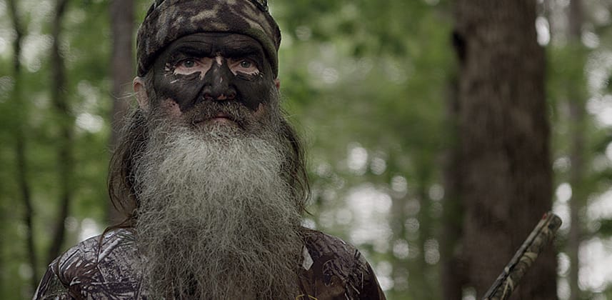
First off, let’s start with the uncorrected footage. This was shot on a RED EPIC, and it looks like we have a lot of material to work with. I like to keep the raw settings in a very flat color space so I can really mold the footage and push it in any direction I choose. For this particular project, I used the REDspace color space and the PDlog 685 gamma curve. I try to keep everything to one primary node since that is normally enough to emulate the look I’m going for and get the point across rather effectively.

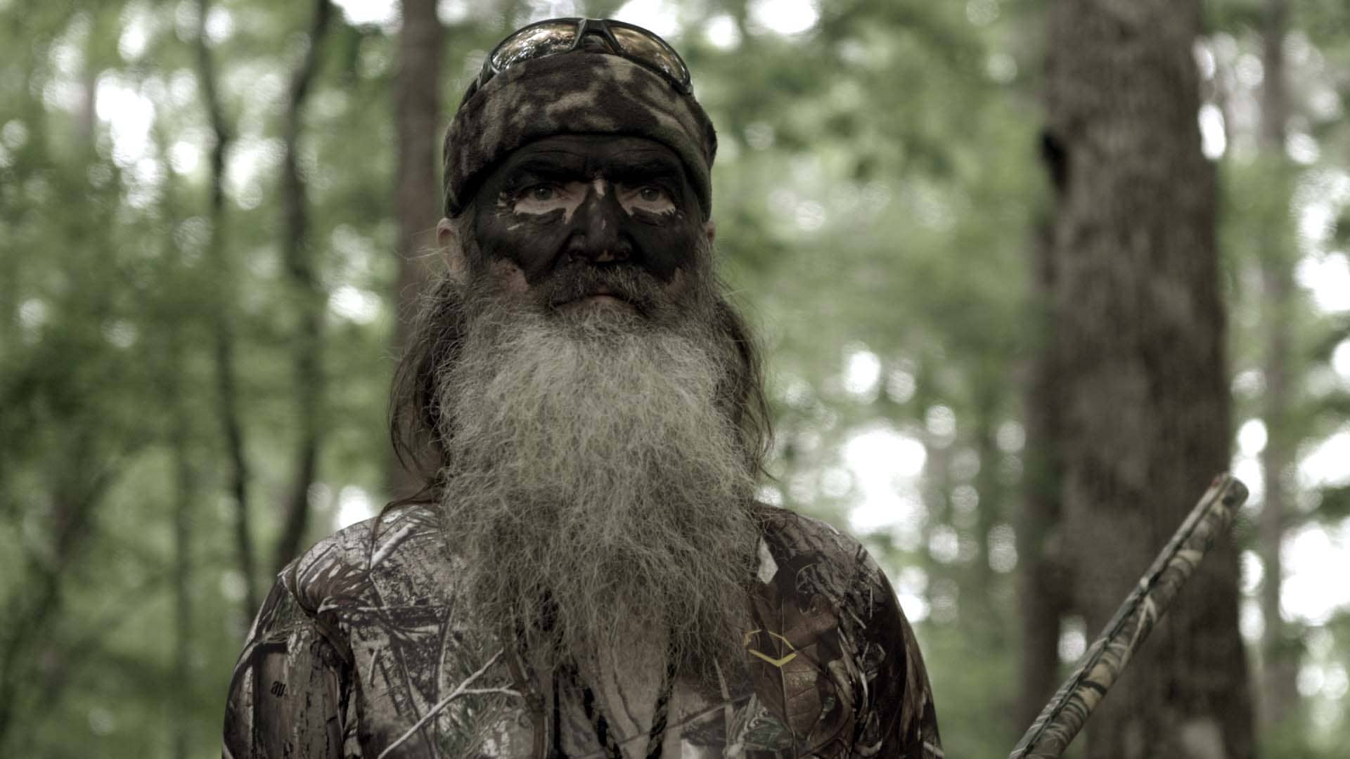
For the first option, I almost always want to choose something relatively safe. Something that I know will work but isn’t necessarily breaking down any creative barriers. So for this option, I just expanded the contrast and kept an average saturation. It’s safe and would work, but far from sexy.

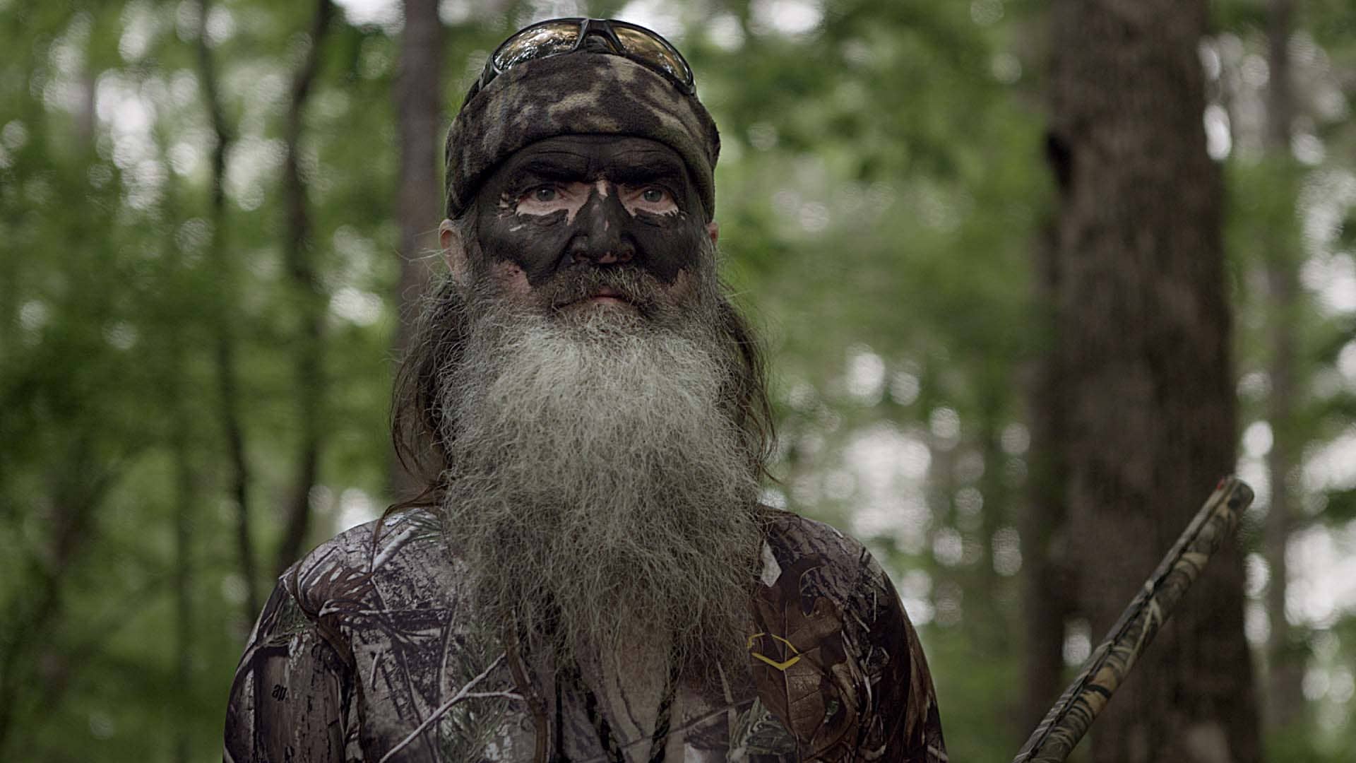
I try to slowly get more aggressive with my looks and plan on showing them in that order. Easing the client into the looks is crucial. You can’t just bombard them with crazy options and say, “Hey! Look at these! They’re awesome!” Take your time, explain why you did what you did, and build off of each look. So the second look I created has a little more contrast and saturation. Note that some of the highlights are blown out in the background, and the green of the trees is much more prominent.

Then for my last option, if I know the client well enough, I try something much more aggressive, which in this case was a sepia-like wash. It seemed fitting as this commercial could almost pass as an old western. While keeping the blacks neutral, I pushed yellow/red into the mid-tones and highlights while sucking out a bunch of saturation. Take note that it really changes the feel of the piece. In my opinion, it’s much more interesting.
The purpose of having all these stills to choose from is to get the creative juices flowing. Both yours and the clients. Talk about what you like and don’t like. Discuss the subject matter and come up with an informed decision. There may be some aspects that work from one look, but not the other. That happened to be the case for this look. The client really liked the wash but thought it was a little too much. We combined the safe look with the wash look, applied some sharpening, and fine-tuned with some windowing and keying to present the final look.
ALL ABOUT OPTIONS
When it comes down to it, it’s all about options and exploring avenues that the client may not have ever thought to go down. They may not like your favorite grade, but that’s okay. Presenting options and showing the client that you’ve put great thought into their session before it has even started goes a long way. It shines a good light on you and shows that you want to make their commercial look as good as possible. Starting the session off on the right foot and showing that you care helps the client leave the session happy and returning for more. And that’s what the commercial world is all about: Repeat business.
– Rob Bessette
