The Art Of Color Grading : Tech Versus Art
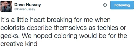
This Insight has been inspired by a great tweet I read from master colorist Dave Hussey.
It’s something I have spoken about here before on Mixing Light and it’s a topic quite close to my heart
I’d like to kick off a series based on how we look at and market ourselves as colorists.
A lot of colorists focus on being the ultimate geek and focusing on the technicality of color grading – monitors, LUTs, calibration, color space math etc. It’s not that these things are important to being a proficent colorist but there is the deal:
Color grading is a Creative job.
Colorists like Dave Hussey, Aidan Farrell and countless others have battled for years and years to shake the stereotype of colorists being geeky engineers.
The geek and technology side of our job is just a bi-product of what we need to know to achieve our creative result. In other words, knowing the precise XY coordinates of a particular hue on a CIE 1931 diagram is great, but does the shot you’re working on actually look good?
As colorists, we take footage from the real-world and add the final touch of magic that along with lens choice and lighting and countless other decisions in the image making process, takes us away from our cinema seat or living room and into the story.
That’s what being a colorist is all about – enhancing story.
Pat and Robbie and I have said several times in MailBag episodes all that matters is what’s on screen, and audience doesn’t care about your amazing secondary curve technique processed through 27 inverse linear LUTs!
Think about your favourite film, commercial or music video – Colorists and color timers have helped create some amazing universes – and it doesn’t really matter the tool or technique they used – what matters is the result and how their creative vision for the project was realized.
The happy greener than green world of Hobbiton in Lord Of The Rings
The hostile world of Omaha Beach in Saving Private Ryan
Even the teal and orange world of Hollywood.
A worrying trend in the world of color grading is that people see our job as ‘apply the magical LUT’ that makes it all look amazing and then make sure nothing is blown out or crushed and then hit render.
This attitude ignores how a colorist has learned to see light and color, shape it, bend it, and make it more pleasing. Not in a 1’s and 0’s sort of way but it a real creative artistic way.
I think a great quote that sums up how our industry is starting to look is from the legendary John Lasseter from Pixar :
‘I remember one guy, who worked with a computer graphics company, coming up to me after a screening to ask what software I used to get the humor in!’
As a colorist, I try and pitch myself as an artist, a part of the process that has as much creativity and adds as much to a project as the editor or composer on a project.
Member Content
Sorry... the rest of this content is for members only. You'll need to login or Join Now to continue (we hope you do!).
Need more information about our memberships? Click to learn more.
Membership optionsMember Login


