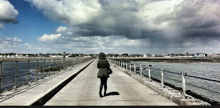
Reference images are an extremely important part of our life as colorists. They help us translate our clients visions and thoughts into something we can work towards. People often say I want it cold, desaturated and contrasty but how to we know how much of each?
This is where the reference image comes in! I’ve had clients hand me reference images with accompanying descriptions that made no sense but I can see what they like with my own eyes I can then grade towards their favorite reference image and I know they will be happy.
Think of the reference images like a client to colorist translator. We may not speak the same language or describe things in the same way but we can all point and say I like that.
Starting Point
In this insight we’ll be taking a look at matching to reference images. When starting a look where the director has supplied me with multiple reference images I try and find the best elements of each reference and build a look that I LIKE. When people hire a colorist it’s not to just do exactly what they said. They come to us for something special, something new and exciting.
Think about why people go to amazing restaurants? The chef will still use ordinary ingredients that anyone could go out and buy but people are queuing up around the street because of their personal touch. That should be our goal as a colorist. Make the image look great technically and then add our own personality and creative flair to the project. I know thats what gets me out of bed every morning!
Use the references as a starting point but once you’ve matched the tone and color of your footage to the reference images forget about them and go exploring!
Matching
In the video portion of this insight I’ll be showing you how I match up a shot to two different reference images. I start with contrast and saturation to get the image roughly lined up with our references and I then pick and choose elements like sharpening, gradients and windows from both references and then combine them to create my own new look.
There is no fixed rules on what you should take from reference images, you don’t even have to use them at all but sometimes you will have a client who will insist that you match the video footage to their stills. This happens quite a lot in the fashion and food grading worlds where you need to match the TV campaign to the Print and Web advertisements. So its worth practicing your matching so your ready for when a job like this comes up!
– Dan
Member Content
Sorry... the rest of this content is for members only. You'll need to login or Join Now to continue (we hope you do!).
Need more information about our memberships? Click to learn more.
Membership optionsMember Login


